Sony Santa Monica may be best known for the God of War games, but it’s become something of a micro publisher in recent years. A lot like the Liverpool-based XDev Europe, the developer also incubates external exclusives such as Everybody’s Gone to the Rapture and Journey, so it’s about time that it got a more contemporary logo to reflect its more varied efforts.
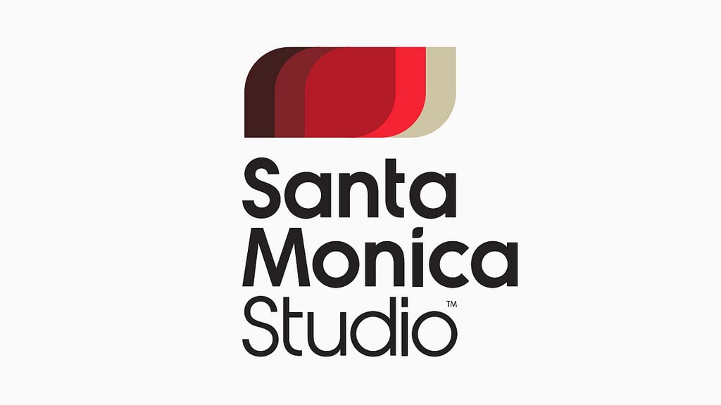
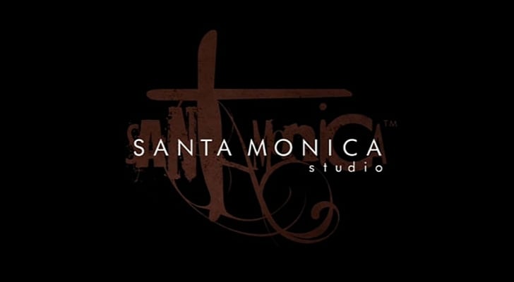
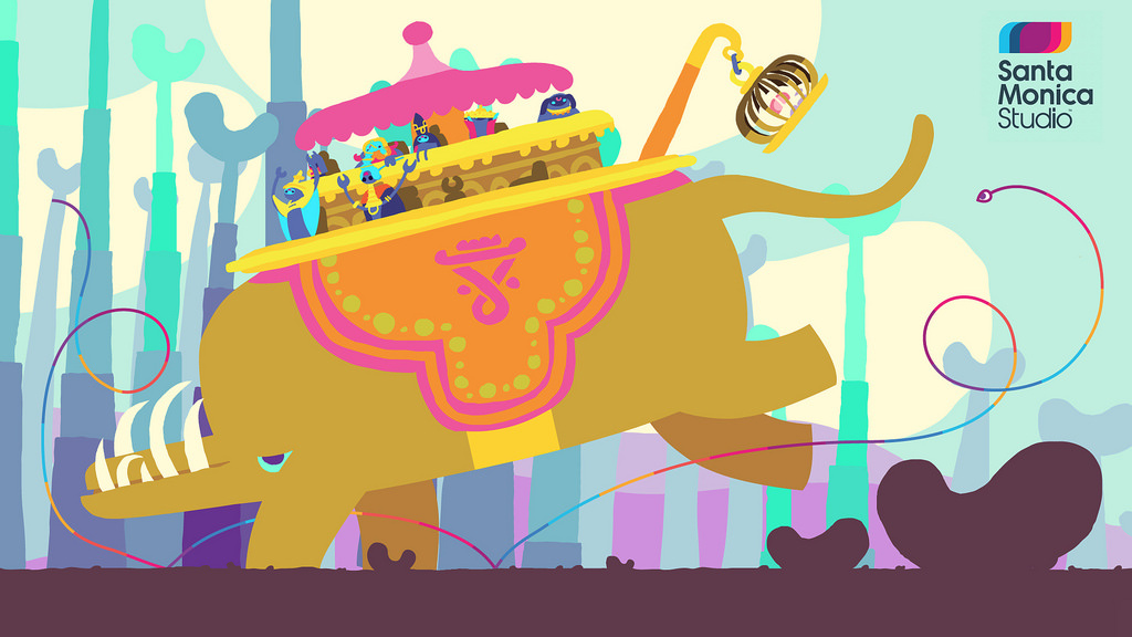
Previously, the firm wielded a scraggy font clearly designed to tie in to Kratos’ somewhat more violent efforts, but its new icon boasts a colourful motif which can be adapted depending on the requirements of the game. You can see below, for example, how it’ll be tweaked to accompany the colour palette of Honeyslug’s weird-‘em-up Hohokum.
“Our new logo, with its bold, simple structure can become a frame to the world of our games,” boss Shannon Studstill wrote on the PlayStation Blog. “When you see the new animated logo boot up with our next external dev games, you’ll further understand how we crafted a mark that allows our games to visually become part of the brand.”
As reported earlier in the year, the company’s also moving house today, to a much bigger location. “We have an incredible future ahead for a new generation on the PS4 under this new roof and with our external partners,” Studstill continued. “Now we have a mark that will continue to evolve and expand with every new game from Santa Monica Studio.”
Sadly, there’s still no word on what it’s actually up to internally since the cancellation of Stig Asmussen’s rumoured sci-fi project, but with Cory Barlog back in the fold, we’d put money on God of War making a return. The big question is: do you think that you can stomach another outing with Kratos at the helm? Shout like a mad man in the comments section below.
[source blog.eu.playstation.com]


Comments 22
I like the old logo better.
@Splat You're a bad person.
@get2sammyb - To be fair, I just hate change in general.
@Splat Same
Im sure many others too
Thing about change is that it's mostly, even if it's only in the individual's perception, for the worse. Taxes always raise, not lower, your body changes as you grow older and not for the better, things of value and meaning become replaced buy cheap replicas of its old glory to thrive the industry (talking about cars here), etc... but one day, a distant day, things might change for the better. One of the billions of idiots might open their minds and realize: hey, I was wrong, and others might follow... oh god that was too dramatic. Sorry. Well everything will turn to chaos, it's an universal law, so better prepare for the worst!
How was the old logo obnoxious? Absolutely bizarre claim! Slow news day?
What is this? There's something wrong the logo! I don't like change!
@voodoo341 It looks like a 90s nu-metal band's logo.
@get2sammyb and now it looks like an 80s logo
XD
Dose any one know if God of War: Ascension is going to be a remake of all the games put together or is it just another game in the story line?
Sorry if i comment this here.
Makes sense since they just moved to Playa Vista...which is nearly Play Vita when you put your mind to it
i always thought the old logo/ design was based on early PS3 downloadable game, Linger in Shadows. It has the same font, and even has the same group of obs/ reality glitching that the santa Monica logo has : https://www.youtube.com/watch?v=XjZxdalCkkE
@MaskedDevil It might have been. I think it debuted with the God of War Collection, though. Either way, terrible...
(I thought Linger in Shadows was really cool, though!)
Agree with Splat. Looks like they make kiddy games with that logo
It's deceptive, because of how that logo is, you think the games will suck when in fact they will be awesome. hehe It would be funny if ND did something like that.
The new logo looks like something you'd see on a 3D TV when you're not wearing your glasses.
@get2sammyb agreed. The old logo sucked. And I thought Santa Monica said they were moving on from the God Of War series?
@get2sammyb
New office, new logo, how about a new IP too to match?
I prefer the old logo. I hope the new God of war has kratos as the main character but I want them to introduce his brother into the storyline now
Don't like it. It looks too much like Sony San Diego's logo. Plus the old one was much cooler and gave us that "God Of War" vibe.
the logo is nice, hope the next game they release is good
Tap here to load 22 comments
Leave A Comment
Hold on there, you need to login to post a comment...