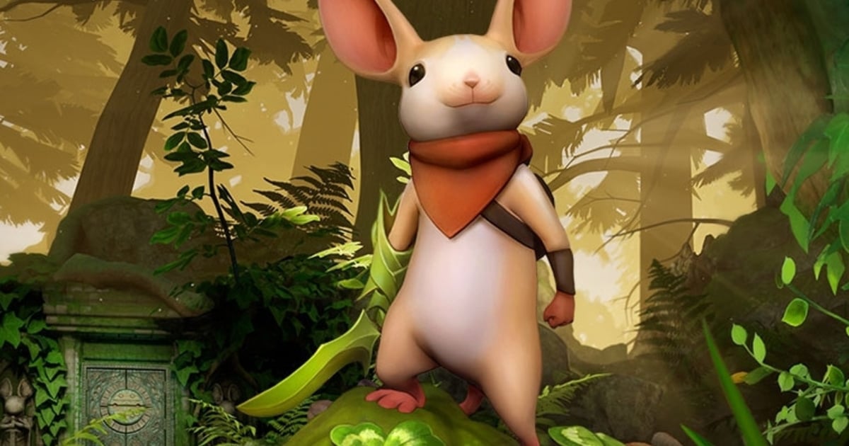
We were huge fans of Moss when it launched on the PlayStation Store back in February, with a single caveat of simply wanting more of it. We're about to get that in the form of a physical release hitting on 15th June, but the boxart is a lot less attractive then we hoped it would be.
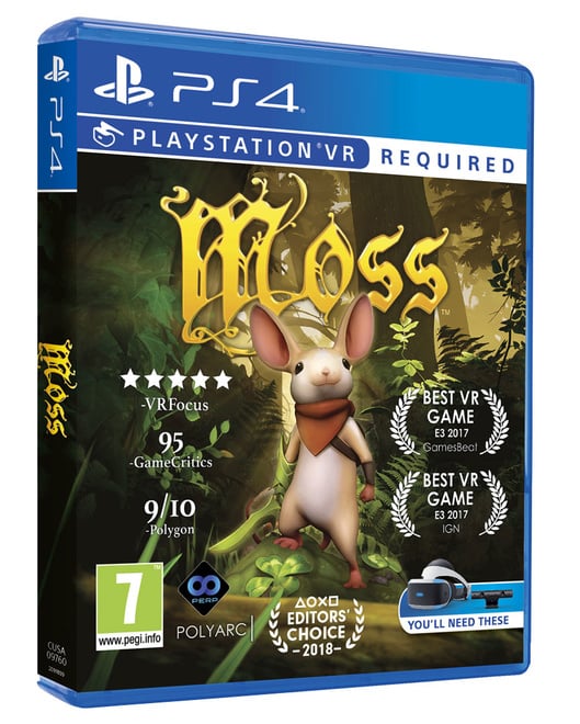
The image itself is fine, but what's with all those review scores and awards littered across the sides? It ruins a lovely picture of Quill herself, and reminds us all too much of probably the worst cover art to exist, Batman: Arkham City's Game of the Year Edition.
Nevertheless, you'll be able to get a copy of Moss on disc for around about the same price as its digital counterpart next month, which is always nice. Do you plan on picking up this physical release of Moss, or does its box art turn you off a little too much? Hand out a Game of the Year award in the comments below.
Please note that some external links on this page are affiliate links, which means if you click them and make a purchase we may receive a small percentage of the sale. Please read our FTC Disclosure for more information.
[source shopto.net]


Comments 23
AHAHAHAH TERRIBLE!
Looks like a magazine cover did by me in mspaint!
Bring back detroit covers!
This is our thing now: moaning about box art.
But what if Push Square's score was on the cover instead?
Well, you aren't getting MORE of it. You're getting the same in a different distribution.
@adf86 Then Ant would be on Twitter bragging about it instead of responding to requests and concerns from his moderators about stuff he just let die
@adf86 Then obviously it would be a superb cover.
Glad I waited on getting the game.
Buuut I'm going to make and print my own cover art to replace it.
@get2sammyb start doing it for DVDs and music cds and slowly start changing the site!
Dear publishers
If you must put all that rubbish on the cover, at least give us a clean reversible version.
Ta very much.
Advertising...
The "praises" are obnoxious but when compared to Attack on Titans 2 boxart...Its a lot better! The picture is ok but AOT2 is literally written as A.O.T 2 and the 2 isnt even the same font as the AO and T.
Its like the Batman Dark Knight GOTY why do you put the scores on there....
@Flaming_Kaiser haha that’s exactly what it made me think of. Arkham city game of the year.
Waiting for this....
I almost don't want a physical version.
Lol they probably needed to do this because PSVR really need a blockbuster game.
I think it is ok. They need people to notice the game
@get2sammyb oh gosh, thanks for reminding me of the batman arkham city box goty boxart. That was attrocious. Whoever thought it was a good idea wants their head examining. Tbh, when i read the headline, i expected the moss cover to be worse than it is, but agree its not great.
Hmm bad box art aside, I may go physical. Ooer.
Compared to some of the Megadrive boxart i've witnessed over the years, this aint too bad
This is one of the cases where I don't mind the moaning, since at least the title is not over the top like some other authors tend to do on pushsquare.
Not hugely annoyed by the cover, just glad it's a physical release as I wanted to play this, but don't buy digital only games.
You could always Photoshop a clean one and get a good quality print of that. Beats having someone's full essay as a front cover.
@Savino HOW DARE YOU... ? XD
But, to be serious, it's pretty obvious that the main goal here is to show ON THE SHELFS that the Playstation VR do possess some killer-apps. You know, in order to boost sales, and all.
Personnaly, I'm glad there's a physical release, and I'm glad that I didn't rush myself on the game day one (was planning to get it anyway, but I had others games to finish first. Now I can bring home this lovely box).
Tap here to load 23 comments
Leave A Comment
Hold on there, you need to login to post a comment...