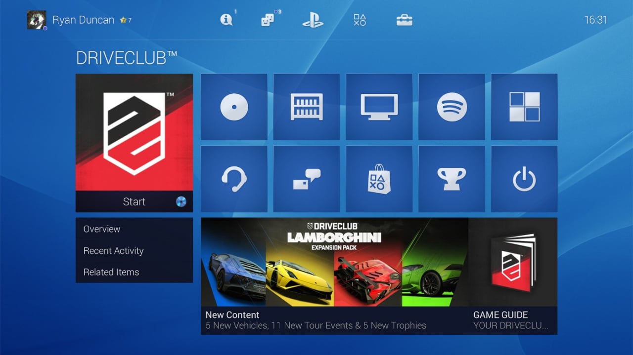
We reckon that the PlayStation 4's user interface is pretty darn good, but it could be better. We're not especially fond of the PlayStation Store icon's placement for starters, but the content ribbon can also be a little clunky to navigate. Fortunately, graphic designer Ryan Duncan has dreamed up a solution to that problem, concocting a home screen that retains the look of the original, while tidying it up.
Instead of employing a long list of icons, it's divided into a grid. Your current disc game is displayed right on the home page, while you have the option to store your favourites in a sub-folder. You can then browse through your entire library by clicking on the appropriate option, while television, music, and apps also have their own categories. Beneath that are options for parties and messages, while Trophies and the PlayStation Store get dedicated icons as well.
Subscribe to Push Square on YouTube167k
To be honest, we wouldn't change anything about the top half of the home screen, but we reckon that this would be a much more organised main menu. We especially like the way that apps like Spotify have a place, without getting in the way of games. Would you like Sony to implement a minor redesign similar to this, or do you think that the layout's fine as it is? Let us know down below.
[source medium.com]


Comments 79
I like this. As I said in the article, I don't think Party or Messages need moving, but I think this grid style could work. Let's be honest, the UI was pretty good on day one, but it just needs refining ever so slightly to make it that bit more scaleable.
No idea what you're talking about--The PS4 has the worst UI of any major console in history. Lining up every icon in a straight line is the stupidest design choice I've ever seen. In any case, Sony needs to hire this guy and release an update.
I like the current Xbox One UI for gaming and TV, where I prefer the PS4 for the store and settings. I hope Sony will follow MS when the One gets its overhaul this November and change the current UI drastically, because the long line of games with the TV icon in it and where you have to scroll down for more info looks so cluttered.
The one we see here isn't really better imo: I want lots of icons of my games in a grid where no further "clicks" are required if I wanna select one. And they should move the extra possibilities, which you hardly ever use, behind the click of the option button or make us tap triangle to immediately show the extras like what's new and stuff.
@naut Nonsense. It's fast, fluid, and very functional. As I said, it could certainly be more organised, but it's not "the worst UI of any major console in history".
@get2sammyb sony should give players the option between a, as you call it, fast, fluid and functional interface, a well organized interface and a interface specificaly made for it's design that doesn't have to be efficient or well organized.
so 3 options:
functional
efficient
design
@get2sammyb
Well Sammy, times have changed, so maybe it is when you put it in the right perspective. The XMB for instance wasn't that bad when it first came out, but now the "grid style" like Windows Phone uses is implemented in our multimedia devices, the XMB and the current PS4 UI feel really outdated tbh.
So it might be the worst in comparison. The Wii U makes me play a game within 10 seconds when I pick up the gamepad and the One has everything I need pinned down for me to acces straight away; with the PS4's game- lint I always get the feeling I had in record stores, browsing through CDs (don't wanna say vinyl cause it would make me feel like a grandpa ).
@Boerewors I can get into a game on PS4 within 10 seconds, too. But we'll just agree to disagree.
Personally I detest the ps4s current ui, I think it's laggy and hard to find what you're after if it's hidden in amongst the 15 icons on screen ,yes I know you can reduce the amount but then you end up in the library constantly.i think the whole ps4 needs a revamp and they need to learn how to use the super ram better because it's like android on mobiles,constantly laggy
@SanderEvers couldn't agree more
@get2sammyb fast and fluid yes. And yea, it works. That's great. Seriously it is. I love that, But the interface is a mess. 7 times out of 10 I'll trade that fluidity more organisation. I just don't understand the design choice.
XB1 is almost no better, but at least I'm a shoulder tap away from accessing my pins. It has it's own problems, but an interface that rarely get credit is Nintendo's Wii U UI. Then again, I would imagine that'l has more to do with the Gamepad integration that makes it more accessible than anything.
@get2sammyb fast fluid?? I've had ps4 since release and they are two words I definetly wouldn't use to describe it
@Boerewors Oh you already kind of covered what I said... I need to be quicker with the fingers. Haha
Ugh.... I wanna hear firmware news already.... 😩
@naut Don't simply comment unless you own the console.
I own one but I have seen both,
PS4's UI is much simpler, easier to understand and fast, the only downside is the doesn't organize the apps very well, and as it says,"This Is For The Players", the UI also focus more on games.
While Xbone have a totally different UI, as it focus more on apps and other tools, and it had an organized menu, but it's way too complicated and took a lot of time to actually understand it, and the UI contains a lot of useless elements too, so it's much slower.
And trust me, simple is better, PS4's UI is definitely better.
I find the ui quite bad to be honest. I really dont like the last 15 list, would rather pin what i want.
I honestly really like the PS4 UI as it is, its fast and simple. I like how easy it is to get what you need.
Can they improve it to be even better and more organized? Absolutely, and I definitely hope they improve on it.
Honestly, I like the PS4 UI as it is now. Yeah, it's always possible to tweak a thing or two, but overall it is sleek, fluid and most of all, functional.
@mikey85 If your PS4's menu is laggy you might have a hardware problem as I find it lightning fast across the board. The only time it stumbles for me is if I open a very rich web page with lots of animations and images while I'm playing a game, but that's about the only time it chugs, and it usually corrects itself in seconds.
I don't know what else to say. I think commenters like @SanderEvers should be careful what they wish for, though. "It's boring" — well, what do you want it to do? Like, do you want it to animate like a 90s Geocities webpage, or do you want to get to your stuff? I'm sure there are a thousand ways they could make it not boring, but it would come at the expense of usability.
I suppose you find your iPhone's menu "boring", too?
What about a UI where you can edit it to however you want? Place the icons in your preferred order. Folders would be nice. Just needs organised better I think. Not the worst UI ever though. Ever tried to navigate the wii menu with a hangover and the shakes? That's pretty nasty.
Their is only one thing I don't like about the PS4 UI, and that is the library. I hate how it still has games, demos and applications I deleted from over a year ago taking up space. It still has the Destiny app from both the Alpha and the Beta which I removed after they were no longer useful.
There is no way to remove them. So everytime I go into the library to start an application or redownload something, I have to go through loads of apps that have no business being there which takes time.
All I want adding to the UI is an option to manage my applications or just a simple pin option.
I know I will probably be bashed for say this but, Sony could learn some lessons from the XB1 UI. The XB1 UI isn't perfect, but atleast it gives you more options for managing your applications.
Other than that, I really like the PS4 UI.
I honestly think some people don't own a PS4 especially when that call it slow (this is a Red Flag), the PS4 is anything but slow. I don't mind how it is now, you can easily find your game & have it on within seconds. I like the info under each game, trophy info, DLC info etc. it's far easier to scroll down the info & see every piece DLC for that game, then what it is to search the PSN Store for it.
I like the UI, the only thing I'd change is being able to pin just the stuff you want on the home screen. Games in order of last played is fine but I don't use all the random apps like music cluttering it up.
Apart from that it's nice and fast, I like it more than the PS3 UI and more than some of the Xbox ones where it took longer to get to your game because of all the tiles.
@naut agreed, the PS4 UI is lacking. I'd take the PS3 XMB over what we have now. My gripe with the current layout is that everything that you've last accessed is just sitting there in a single row with no real organization. I love that's is buttery smooth though, but can't say the same about the store lagginess.
Oh, and let's not start on a iphone home screen shudder
I just want to stick my favorite games at the front. I hate it when after I use spottily or the headset app they appear at the front of the line.
PS4 UI needs a huge overhaul laggy and Unimpressive by far
I actually find it nice.
For the masses out there, it is is simple and lightning fast. I also like how it arranges your recently used icons, as that is what u will more than likely use again. Everyone I know personally thinks it is a smart design that allows for instant access to your game. What more do u want from a console ui?
I like it.
Let's hope this becomes a reality.
This looks nice but like most, I'm ok with the current design so long as I could lock in my fave games and how many I'd like displayed. Rather than a complete overhaul I'd like Sony to just give more customization options. Like favorites, folders, drag around icons to place them where we'd like. Ok maybe that IS a complete overhaul and possibly asking a bit much
The PS4's UI could be better, but this comments section is absolutely mental and soaked in hyperbole. Shocking performance.
I have always found the PS4's menu to be fast. I have never had any lag problems whatsoever.
A straight line for the apps might not be the greatest thing ever but in-terms of the speed of browsing through them it's been great for me.
The organisational ability of the PS3, with the speed of the PS4 would be perfect. I loathe apps I don't use continually appearing at the front of my games list. And I also hate the fact Sony are rubbing salt in the wound by placing all the Media apps I don't want in a really nice folder and shoving it in my face on a regular basis! I want folders like that for my stuff.
Iv got a launch ps4 and have never had a problem with UI lag. I didnt realize so many people didnt like the PS4 UI, but then again no one liked the XMB during the PS3 days either, im always in the minority.
The PS4 UI US terrible. Sony should let users customize it as they like. Not force their own apps in between games.
This stuff and custom themes would be reason enough to jailbreak the console once something is available.
I like the current one, but I would like the option to customise my games into folders eg: Party Games, Favourite games etc. The grid style could definitely work though as I'm not the biggest fan of scrolling all the way along to get to the games library
I see this as Metro of Microsoft anyway
Basically make it like the wii u/3ds/wii. Nintendo has already perfected menu interface. One line is archaic and annoying to maneuver.
As nice as that guy's grid is it takes up too much real estate. How are Sony, and the game companies, meant to sell themes if there's not much spare screen left? As for lag, never had any. Only thing is, whilst in party chat, if you scroll through your list of games, you get interference on the headphones, which can be rather annoying.
Start console, select first game icon, play game. Pretty simple for me.
@get2sammyb I love the ui as it is and would hate to see a grid system introduced as it would just clutter the screen for the sake of it. By all means have options for those that prefer it but I can't understand all those having difficulty holding right for a second to see everything you have. I only tend to play a small number of games at any time so they all tend to bunch up at the beginning of the list which is good for me and it's hardly an inconvenience to click x twice to play, whilst giving me that extra bit of information just before the second press. Granted the library does need to give you some options to organise and the playstation store needs to be put back where it was but other than that I'd leave it as it is
@#2 xboxone and xbox 360 is hard to find what i need. no neeed to have the icons all over the place
I like the look of this new design, it feels more cozy, but if there was something i would definatly wanna change about the home screen then it would be that i could choose what apps it shows, and id also like an easier way to shut the ps4 down instead of just putting it to sleep
No it looks like an awful boxy Windows clone. The xbar is a brilliant invention of simplistic user interface design. Sony should not waste such innovation and pander to the Windows crowd in the hope of convincing xboxers to jump ship.
If Sony want to add more functionality up front, why not have 3 horizontal xbars. The top one for settings, the middle for games and the lower for apps and social stuff. That way the screen remains uncluttered and only expands content out when you roll over it.
It's a shame Apple have patented their Mac OS dock with magnifying icons. That's probably where the xbar idea came from and would allow the icons to be shrunk in size so they only enlarge when you roll over them.
3 slim horizontal xbars would look really neat then and be a differentiator from the xbox. The interface shown here is Windows 8 and 10. Ugly and boxy. Too much in your face like an advert page n a magazine.
I don t find the ps4 UI so bad. Just give me the possibility of organize icons in subfolders and the option to pin my favourite apps andbgames at the beginning of the bar.
Still a desktop view with all the icons together would be feasible, at the end we have a touchpad we never use....
Yes yes
Keep it how it is but give us the option to hide things on the menu that we dont use, like PlayStation video and whats new.
Lets fight against pushers!!!
@naut Clearly you haven't seen the Xbox One interface, confusing and ugly.
I own both consoles so I'm no 'fan-boy', but if you go on Xbox One you'll have a new appreciation for the PS4.
I quite like the way it is, just needs a few tiny tweaks and it'll be prefect.
@get2sammyb since I installed the journey theme the ui flags on startup and then is great a minute or so later. I'm gonna take it down as it was fast previously.
I don't mind any interface as variety is the spice of life. But we should be able to have a couple of files in the library to store games no longer on your hd which you own as they are all at the bottom of my owned library and it freaks me out. Also trophies should show even if your not connected. Otherwise I don't really care as long as I can access games easily - which you can.
I got so excited when I saw this. I thought it was a genuine UI redesign. This UI looks utterly gorgeous. I would love it if this, or something similar, was released officially in an update for the PlayStation 4.
Why don't they get graphic designers to make loads of different UIs, then take the best bits from the best ones and put it all together. The current UI is nice, but it's not really outstanding. I personally don't like it all that much.
@Mrskinner Couldn't agree more. In principle the idea of the icons is great but things I do not use, such as TV, I want the ability to remove. All I need is the store and my currently installed games.
Still at least I haven't got a bloody great Singstar icon permanently stuck on my UI for no bloody reason.
I think it's an ok UI. It's nothing special. I find it quick and it does its job with a decent design. Some people on here are flat out lying saying it's laggy. However I do agree, we need an update with pin/folder support.
@dnky666 lol I actually emailed Sony to complain about that Singstar icon. They told me I should be greatful.
I like this guy's idea. It's very neat. Unlike the cluttered present up of the ps4.
@naut Even worse the X1's UI that was designed with voice commands from the Kinect (which no one ever uses)?
I want a User Interface that is so customizable that I can literally create an icon from any area or object on the screen. Even to the point where only I would be able to use it. Of course it does not need to get to that extreme but I'd rather have as many options available to me as possible. For instance. Let me hide what I do not or will not ever use at all. Let me organize to the point that what I want and use most is immediately available to me. I may have to just create this interface myself.
@ZhanWeiGoh How is it too complicated to understand? are you an ape? Between the PS4 and XB1, the PS4 UI is far slower to navigate. Unlike you, I actually own both so I know what I'm talking about and just because I love my PS4 doesn't mean I'm too fan-boyish to admit when another console does something a little better.
@DonnyDave Confusing? lol a bunch of tiles clearly stating what they do, and you find it "confusing" and the ugly part is a matter of taste.
P.S Bollocks do you own both.
am i the only person who prefers the ps3 menu? i loved the small icon that were not in the way of my awesome wallpaper of choice. and being able to change the icons with different themes was awesome. i always made them clear. i hate the obtrusive ps4 menu.
@get2sammyb I have to agree this no way the worst interface on a console. Infact it's very easy for children and people with disabilities. Plus the design for me looks to be made not just for the big view, but for use of the remote play. But I have to agree organising is the next step. I use a 27 gbps hdmi with fibre optic speeds of 30 mbps, and the speed is incredible, especially in the ps store. Definitely not the worst.
@LAZ87 Clearly an Xbox fanboy then. How is it so inconceivable that I have both? I got my PS4 for the PS4 exclusives and the XB1 for XB1 exclusives, do you understand? Or do you want me to use only one syllable words?
Apparently ive gotten stuck in opposite land again. Dammit!!
This looks awesome. I would much prefer this since it would essentially get rid of a lot of the scrolling on the UI. Sony should see this and take a hint
@DonnyDave Haha no I'm not a fanboy, far from it, I just think it's hilarious that someone finds something that's pretty simple so confusing, especially an adult. Anyway, enjoy both consoles big spender
@DonnyDave Oh and stop trying to sound intelligent, that ship set sail when you said that you found the XB1 UI confusing.
@adf86 I use the voice commands all the time. Saying "Xbox go to (desired app)" is easy as hell. No searching at all. I love it. But on topic, I have no quarrels with the PS4 ui. Is it perfect? Of course not. But it is pretty simple, and I have no trouble navigating it.
@get2sammyb It may be fast and fluid but it is a nightmare to find a game that you have not played in a while. Once it has gone off the ribbon, you then have to go into your Library (which contains EVERYTHING!) and search there.
I have to agree with others on here, it is a very boring OS.
I am getting on Xbone this week so I will be able to see the difference between companies but I have Windows 10 at the moment and the Xbox App (which is going to be the future One's layout) knocks spots of the PS4 OS.
Once last point, why can Sony not do a Total Play Time!? Xbox does it, 3DS does it (an WiiU? Not sure about this - can some one confirm) and Steam does this! It cannot be that hard. They need to have a feature where us the players can recommend features that need to be added. I believe there is one but I doubt they listen.
All in all,...
Microsoft = King of the OS
Sony = King of the Hardware
@banacheck For me it slows dwon wehn im playing games that are heavy like batman it needs to come back at speed. but mostly it just works.
@TerrorByte The funny thing is it doesnt do dutch for me its no problem i speak good english. But it feels kinda sad after more then a year of waiting still no dutch or in holland you had to import the console to even get it. To be honest i just didn't get teh console and waited a year to get teh PS4 i had to many games on the PS3 wich i still have.
@LAZ87 Oh get a life you petulant child.
@DonnyDave It's to much money for me to get a second console not that i cant afford it i rather buy six games more and i still have my PS3.
I love the new UI if thats it it looks really clean but thats personal.
@Flaming_Kaiser I prefered the 360 interface, but as you say it's all about personal taste On a different note, I do like the fact that XB1 downloads are so much faster than that of the PS4, the speeds fluctuate on PSN, but Live is a lot smoother.
@Flaming_Kaiser Sorry I misread your comment, were you referring to the PS4 or XB1?
I like it how it is Please don't change it like other companies change things for no reason(it seems)
To be honest I tend to spend hardly any time in the actual menu. I fire up the pS4 and either go into NetFlix/Amazon/BBC or play a game. And that's pretty much it. I'm probably the only person in the entire universe who actually like the location of the new PS Store icon. Since it's moved it works every time, whereas before it would sometimes fail to connect and I'd have to stop/start my PS4's internet connection.
@DonnyDave I must disagree also owning both. I greatly prefer the Xbox One's interface when it comes to doing most things (except the store, that is appalling). If the PS4 is to take anything for Xbox's interface its how well it does linking your "networks" easily together and keeping you within arms reach of everything else.
@Warruz I agree on the connectivity front, not to mention PSN is frequently having issues, and Live seems much more stable.
I thinknthey should allow the owner to customize the dashboard as they see fit. I own a Sony Xperia phone and tablet, it would be awesome to Have them all set up the same
Folders please
Show Comments
Leave A Comment
Hold on there, you need to login to post a comment...