A limited-edition PlayStation 4 console was revealed yesterday for the upcoming launch of The Last of Us: Part II, complete with decals honouring Ellie's tattoo. It looks incredibly cool, which combined with a number of new accessories, makes for a gaming setup fit for a king. That was all well and good, but some fans were actually drawn to the artwork the console's packaging will sport more than the system itself. A lot of fans have taken a liking to it, so much so that they're turning it into the game's PS4 boxart.
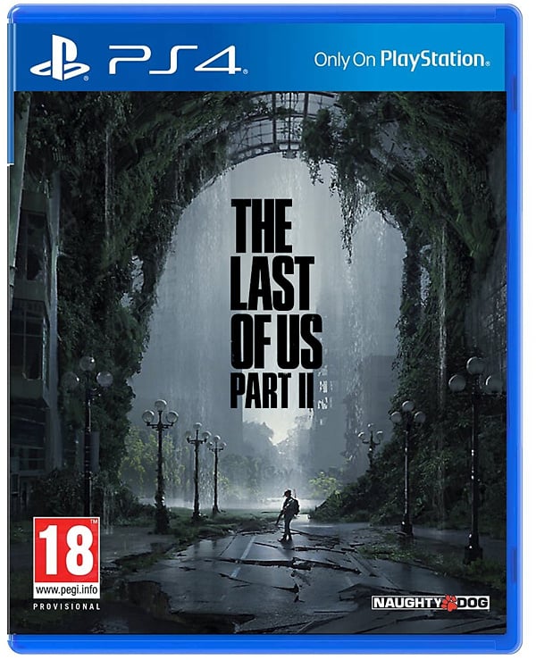
Put together by ResetEra user Chaystic, this new variation looks absolutely fantastic. Rather than a close-up shot of Ellie's face, we get a wider view of the world of The Last of Us: Part II complete with the protagonist in the centre wearing a gas mask. Ruined streets and a huge amount of greenery surround her. The game's logo also features prominently, of course, with bold, black lettering.
Subscribe to Push Square on YouTube168k
We're big fans of this fanmade mock-up, but then we quite like the boxart Sony will be using for The Last of Us: Part II in an official sense anyway. Which one do you prefer? Share your thoughts in the comments below.
[source resetera.com]


Comments 31
It's cool artwrok for sure.
Oooh I much prefer that to the official one.
I much prefer the isolated and ominous feel of this mockup cover. Do over, Sony! I know it's probably too late to change the printed cover graphics, but surely you can use this artwork for the digital version of the game?
I prefer this one over the actual boxart, by far.
Its a million times better than the official cover and tells a much more compelling story than the one we are getting
The original "constipated Ellie" box art is horrible. What actually happened to the cool minimalist slip cases Sony had for its exclusives? Maybe they're just waiting for diehards to double dip.
It's better than the official one with Gollum on it.
Very cool.
They should use that artwork with the black PS5 case mock up from a bit back. that would look super classy.
Way better than ellie face on it.i can dig it.word up son
Very nice artwork.
that looks great !
It’s a cool pic for sure
Already better than the actual artwork
Waaaaay better than the bleak "Angry face" official cover.
Publisher needs to put some love on cover arts. Its like Death Stranding cover... A lot of wasted potential for an amazing art.
I Don't Know Why But That Box Art Looks Like Something You Would See On The Box For One Of The Metro Games
Just still looks like concept art to me!
I didn't like the "real" box art at first, until I understood that "revenge" was the key word for the sequel. The "From the Beginning" trailer showing Ellie morphing from a child to an adult and getting more and more angry is what finally sold me on it.
Check it out if you haven't! I almost guarantee it'll make you like the angry-face box art
Said trailer : https://www.youtube.com/watch?v=JclKytWG9Ro
Never really been that bothered about box art. I look at it once while I'm unwrapping the game, and after that, it spends 99.99% of its life on the shelf where I can only see the spine.
Why is it so much better than the actual one?
Its a beautiful piece of art, but why are all the lamp pole globes so clean and intact while the windows in the building all shattered and broken.
The source is resetera, go figure.
Seriously, this or the one with ellie hiding behind tree with machette is way better than close-up 3D face of ellie on the cover
Edit: This image, I think it's perfectly captures the game even if people didn't know tlou and ellie. A young woman with weapon hiding against many enemies, it shows the game must be played with stealth but the protagonist can attack and defeat the enemies.
I concur this is by far and away better than the actual cover. The actual cover is frankly...off-putting. I don't really want that on my shelf or on display in any way at all.
@ApostateMage That was my first though, I was wondering if he was in the game or something 🤷
This is way better than the actual one which looks horrible and cheap, it seems no effort went into the official one.
Try anything you want, not gonna cover up the fact that this game is a complete failure already
I saw the artwork yesterday and it's stunning. But this mockups isn't well structured with such a small title on the cover. Second the contrast ratio is really bad, making it less readable. This will never get a go from Sony we're it among mockups. It doesn't stand out enough. Make the title bigger and more pronounced and it will look better. Though perhaps the scene itself is to small and detailed for box art. It could be a killer poster. I don't think it fits well I. This form factor
This is beautiful. But I still love the real box art all the same. I think a close up on Ellie's anger captures the theme of "hate" Neil Druckmann is talking about pretty well.
Much prefer this to the "big face" cover, personally. Always prefer to have more arty covers but I get that they don't necessarily deliver the messaging on the shelf the way that more "ordinary" covers do. Wish more publishers/developers would offer alternative covers for pre-orders that haven't got all the text, barcodes etc all over them and stuff.
Nice. But the story ****spoiler alert**** still sucks balls. So no matter how nice the art is, it wont furnish my shelf.
I don't really care about the series, but that is an awesome cover
Looks much better than what they went with.
Boxart should just be a golf club. Pure and simple
Show Comments
Leave A Comment
Hold on there, you need to login to post a comment...