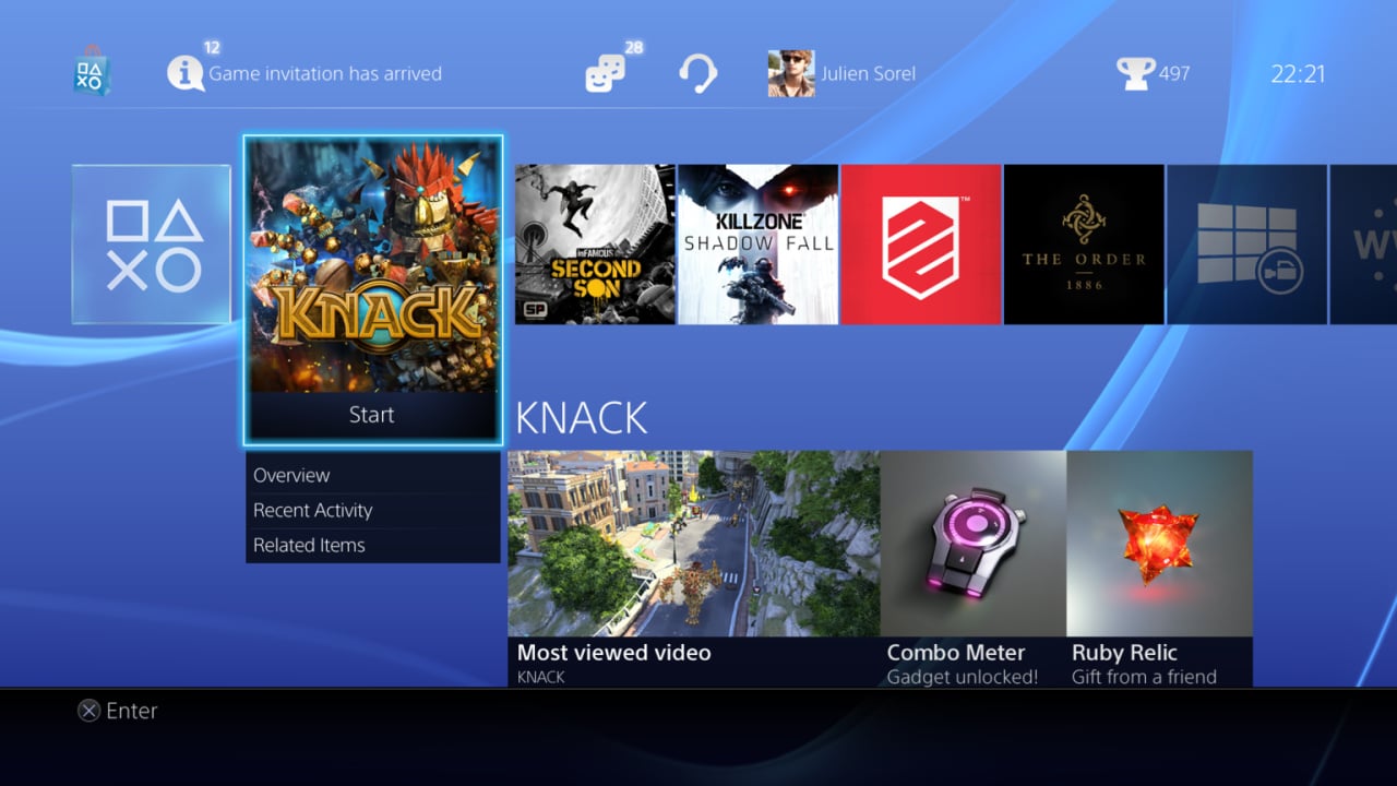
While there are a slew of stellar titles set to accompany the PlayStation 4 onto store shelves later this year, we suspect that many of you will be eager to spend launch day merely messing around with the next generation console’s menus. Alas, if November still feels too far away, Sony has released a brand new batch of high-resolution screenshots that show off the system’s interface in its near-final state.
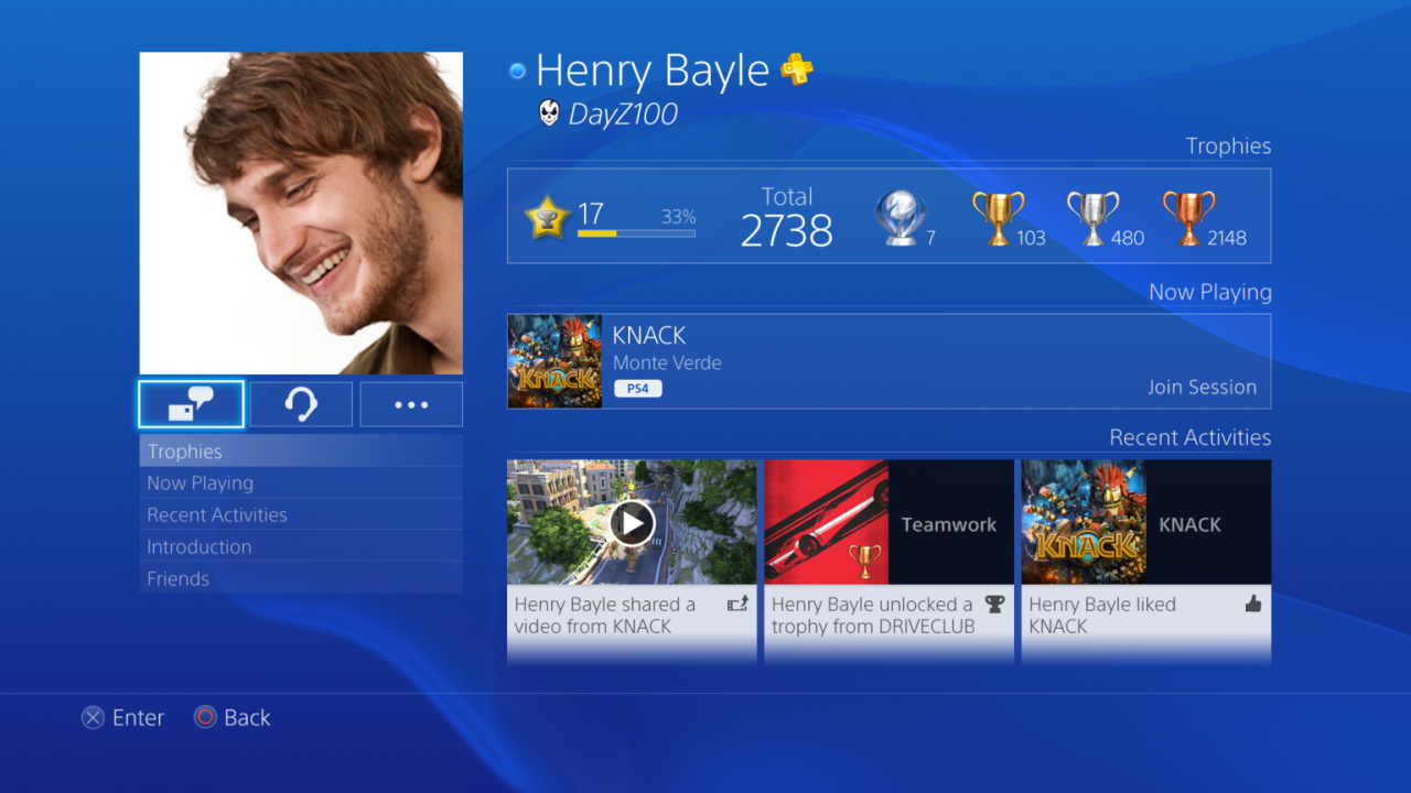
The new images don’t really show anything that we haven’t seen before, but the platform holder appears to have spruced things up in the run up to release. For example, the firm appears to have adopted a much more palatable shade of blue for the default background, though we suspect that this will be totally customisable. Elsewhere, the home screen – which displays all of your games – now includes even more content on the upper task bar, allowing you to peruse Trophy information, game invites, and more.
Subscribe to Push Square on YouTube168k
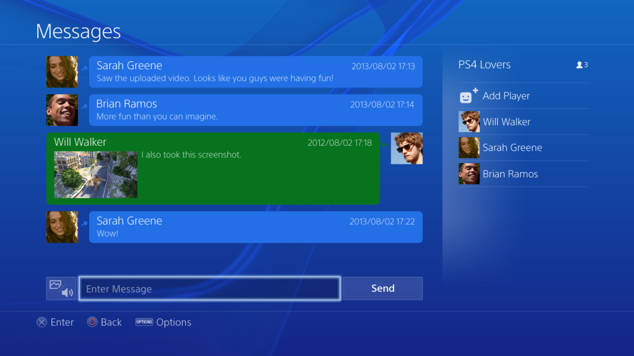
Other improvements span a much tidier stream of comments on the live gameplay screen, as well as a far more intuitive editing tool for video uploads. We really like many of the improvements, but we’re not so sure about the PlayStation Store bag on the home screen. That looked much better when it was a white silhouette, rather than a full three-dimensional render. Still, it’s improved in virtually every other area – now if only we could get a better demonstration of everything in action.
Do you like the look of the PS4's user interface? (54 votes)
- Yes, I think that it looks very sharp and functional
- I like the layout, but I hope that the colours can be customised
- It's pretty, but I'm still not convinced that it will be very functional
- No, I think that it looks poor and awkward to use
Please login to vote in this poll.
[source community.eu.playstation.com]


Comments 27
It's very blue that's for sure.
Sarah Greene: "Saw the uploaded video. Looks like you guys were having fun!"
Brian Ramos: "More fun than you can imagine."
All right, steady on there Brian.
@ShogunRok It's not even the real Sarah Greene...
The new UI looks cool.
I love the UI, but I hate bright colors, so I'm hoping I can change the background to a deep purple or something.
@Lelouch I'll be gobsmacked if you can't customise it. They're going to want to sell themes, etc. I'm sure you'll be able to.
@get2sammyb I hope we can finally change the font color too. Especially with the brighter wallpapers and themes.
I'm quite fond of this layout
It's aight. I don't really get why your face needs to be on there. I feel like many people's cats will be their profile pics. Including myself
I hope it's not going to be too polluted, i like a visual like XMB for PSP and PS3, although i enjoy the bubbles scheme used on Vita.
@get2sammyb If the themes are well done and reasonably priced(99 cents) I'd be happy to buy them.
@DilMan33 I do that on FaceBook.
@charlesnarles You can use your standard PSN profile if you prefer. You don't have to include your real face/photo.
@get2sammyb Thanks Sony, hacked again.
While I DO hope the background colors can be customized I really hope there will still be custom/dynamic backgrounds a la PS3. While it looks like the XMB is still underneath it all I doubt there will be much to customize in the way of that so I hope the background/theme options will remain as cool as they are on PS3.
@charlesnarles This avatar you see here will be my profile pic... I am glad to know we can get away from our PSNID if we like... I hate mine but I have so much content and trophy data associated with it I just can't part with it so having photos/'real names' is very exciting to me!
I like it, them pictures of games are your downloaded games like the PS3? I like the layout, you'll be able to customise it & change the background colour anyway, like the PS3. You'll get avatars off the PSN store like now, as there is no way i'm using a picture of myself.
@get2sammyb I also hope we can customize it as well like we could with the PS3.
ohh boy i think i just jezz a little
I hope like the others are stating I want to make my own background design regardless of it I love the UI.
@Snkfiend Same. I never designed my own but I would like to try though. lol
I'm positive you'll be able to customise, change colours, buy different avatars etc. After all Sonys added the replaceable HDD again, it's still region free etc, i just cannot see Sony not adding it.
@banacheck Same here it would be weird if they did not allow it.
I like the look of the UI, but they are only showing such small bits. There is so much I want to know about functionality, and they have released virtually no information.
I am really hoping for better management of users, parental controls and content/folder customization options etc. The PS3 attempts are very poor in both those areas. It had better be faster than the XMB as well!
It doesn't sounds like MS have released any real details of theirs either yet, so I am imagining that both are still being refined as we speak.
It looks good. Going to have to get use to it and I will probably spend the better part of launch day checking it out since for the last few years I have been using the 360 interface.
I hope they don't allow color customization. Black and blue is Sony, just like white and green is Microsoft, and Nintendo, well I don't know about Nintendo.
Have we seen the store yet?
@ObviouslyAdachi Still, they shouldn't leave out customization for the sake of brand recognition. It's like saying they shouldn't allow different themes. Just don't change your's Besides, I would love to make it a Persona 4 Golden color scheme, though it would probably melt my eyes with its brightness _
Show Comments
Leave A Comment
Hold on there, you need to login to post a comment...