EA's dynamic Frostbite engine is best known for its incredible environmental destructibility, which is central to its Battlefield franchise. For the last decade, this was represented by the iconic fractured hand logo on the splash screen of games that used the engine. Signalling a new shift in philosophy, EA has announced a bold new rebrand (it's still a hand), going to great lengths to explain what it means, which we will relay to you now.
In a detailed post, EA explained that the new hand "signals not just a visual shift for Frostbite, but a philosophical one, with a renewed focus on partnership with our teams and creators". The previous logos depicted the hand in a fractured, broken state (below). Moving forward, the company wants to "tell a different story - one about the collaborative relationships transforming Frostbite from within."
Because of this, it was decided that the new logo should be "constructed from consecutive, overlapping layers; our new handprint embodies how our teams build upon each other's strengths, reaching beyond what is possible when they work alone".
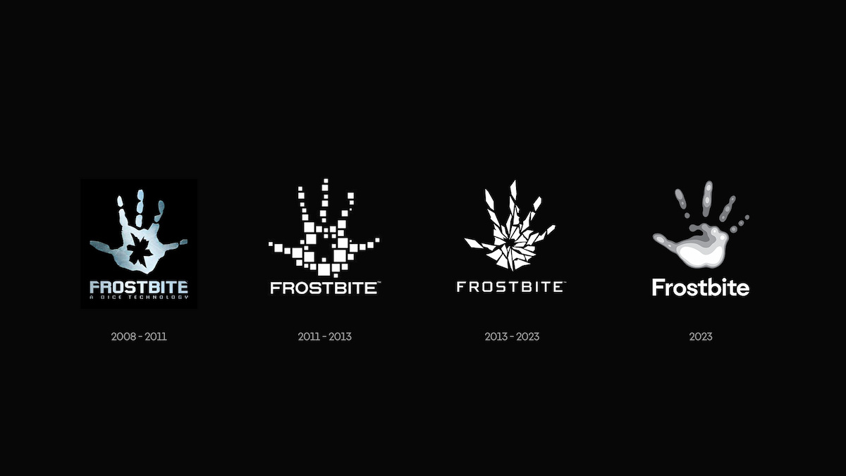
Famously, the complexity of Frostbite made the development of Dragon Age: Inquisition a real headache for BioWare. But even concerns about some of the engine's rougher edges are addressed by this marvel of modern graphic design: "The sharp, cutting edges of previous handprints have also been smoothed out, creating more fluid shapes. This reflects our commitment to addressing Frostbite's rougher edges, creating a smoother experience for creators and players."
What do you think of the new Frostbite logo? Does it (ironically) look like a hand heatmap, or are we overthinking things? Let us know in the comments section below.
[source ea.com]


Comments 13
Historians will point to this as a clear era change of the universe.
Google P.R translate: We didn’t want the logo to be a alien hand with a butthole in the middle anymore
And EA’s public relations send out a press release as if this were newsworthy and gaming websites write about it as if that were true.
I saw a popular post dunking on this change on X, and I just want to say I think it's better and looks cool. My only gripe is the text looks weird.
Time for Frostbite 4
Do the people in marketing and design know how pompous and vacuous their "explanations" sound to normal people?
""The sharp, cutting edges of previous handprints have also been smoothed out, creating more fluid shapes. This reflects our commitment to addressing Frostbite's rougher edges, creating a smoother experience for creators and players."... seriously???
Press release written by an English language graduate for sure. Serial Wafflers
@Triumph741 if they don't confuse it for an X-Ray.
@Olmaz "Do the people in marketing and design know how pompous and vacuous their "explanations" sound to normal people?"
Pretty sure they do because they ARE in marketing and design where both words are pretty much in their job description.
Not a fan myself. New hand looks like it’s a 5-second live trace in Illustrator tbh. The 2013 ‘fractured’ one is the best for me.
What's the purpose of this? To signify better times lay behind us?
And where is that bite of frost? They missed something... This is copy of copyrighted System of a Down selftitled album.
@Bentleyma or some blue and purple 🤔 man frostbite hurts
Not sure if this is really news worthy for a PS gaming site.
Show Comments
Leave A Comment
Hold on there, you need to login to post a comment...