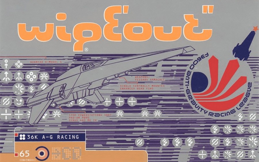
Font nerds of the world unite: we’ve got a piece of trivia here that will have your Times New Roman twitching! Did you know that WipEout’s iconic PS1 logo was made up of a bunch of 8s, all aligned differently and cut out to spell the name? Don’t believe us, well here’s the irrefutable proof:
It’s such a simple design when you see it presented like this, but it makes for one of the most cohesive, futuristic game logos in the history of the medium. For those curious, the Eurostile font, upon which the WipEout logo is based, was designed in 1962 by an Italian typeface designer named Aldo Novarese. The more you know, eh?
Obviously, the WipEout logo has evolved over the years, and no longer retains the same shapely style, but elements of the original, like the rounded capital E, remain. Still, it’s really mind-blowing how great graphic designers are able to take such simple concepts and transform them into such recognisable and eye-catching pieces of art.
[source twitter.com]


Comments 12
Interesting fact, thanks.
I loved Wipeout XL and I had achieved 1st place in all races including the bonus ones that get unlocked. I remember two of those bonus levels were hard as hell to get 1st.
Always wanted to work for Ian Anderson and Nick Phillips.
The designs in general were amazing.
"The Designers Republic WGD/GGG" is on of my fav Art books in my collection. Fantastic Design Studio.
If there is a game that needs to be made to work on PSVR2... it is WipeOut Omega Collection
I love this fact. How cool!
Never knew that, brilliant!
My favorite track from Wipeout XL (2097) was Photek - The Third Sequence. The only reason Firestarter wasn't number one for me was because it sounded a bit different/softer and the lyrics were missing (understandable though.)
Ha. Cal Skuthorpe is the guy that designed my avatar over there on the left. It was for my prop making company - Landstalker Props. Small world.
@Kairu tidbits** but i somehow like your spelling of it better lol
@Kairu TIL thank you!
But... why? Is the number 8 significant for the game in some way?
I actually did because I was doing some Wipeout research a couple of years ago, as I am want to do because Wipeout is one of my top 5 all time gaming series' and Ian Anderson/tDR's design work in the late 90's/early 2000's is a massive inspiration on me, and I found this twitter thread from Y2k Aesthetic.
https://twitter.com/y2k_aesthetic/status/1072867891396075521
@XinGViruS Stock car racing (which wipeout was heavily inspired by) takes place on a figure 8 shaped track, but it's mainly meant to represent a stopwatch to emphasize the speed of the series.
Yes, actually, a friend of mine who was studying design at the time pointed it out to me as soon as he saw it, it's a nice touch.
The cover to David Bowie's Black Star album uses a similar trick using cut up black stars to use as the typeface.
Show Comments
Leave A Comment
Hold on there, you need to login to post a comment...