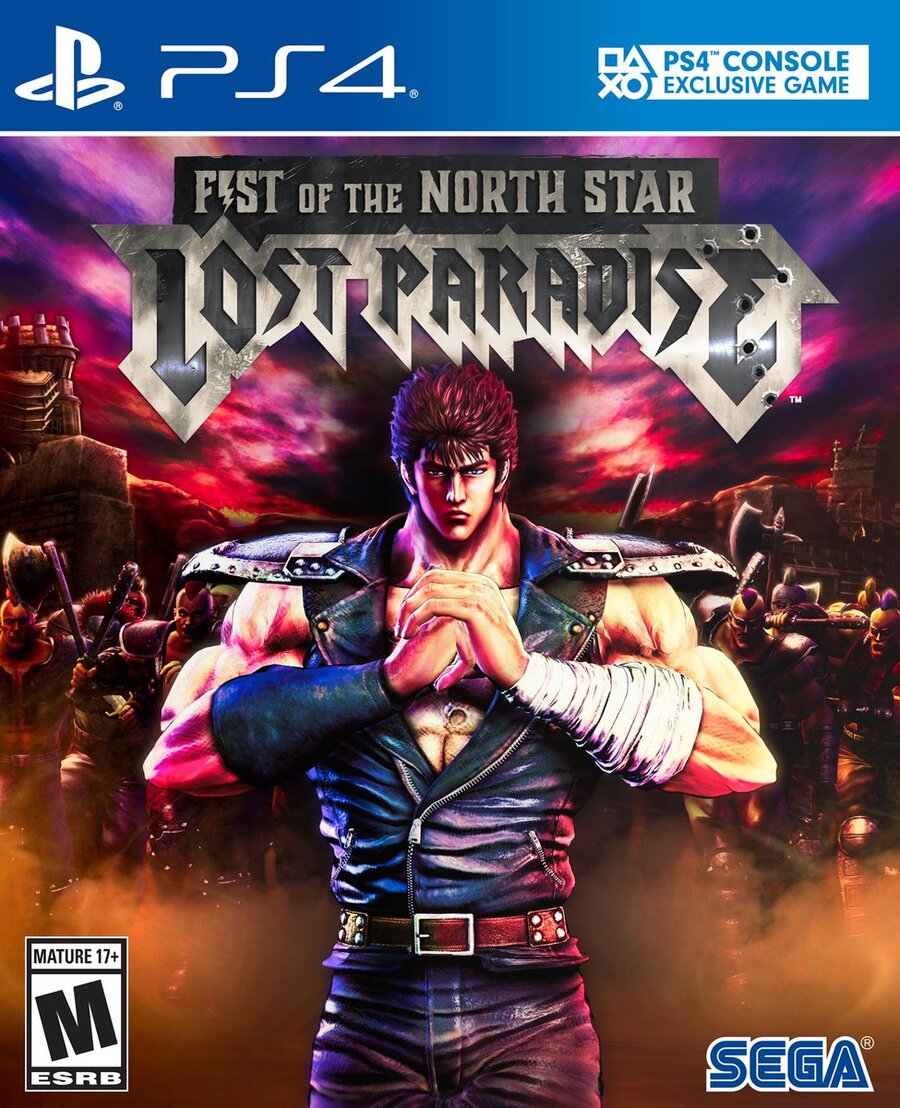
The box art for Fist of the North Star: Lost Paradise has been revealed, and it's thankfully not too shabby. As you'd expect, it features main badass Kenshiro cracking his knuckles as his enemies swarm behind him. The colour palette is quite pretty, too.
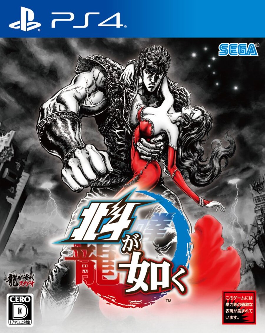
But it's not quite on the same level as Japan's old school manga style cover, is it?

Dare we ask which box art you like best? Burst some heads in the comments section below.
[source twitter.com]


Comments 22
The second one is beautiful. I wish they would’ve gone with it, but some people might have gotten angry with it over here.
Both are not beautiful in my opinion.
Maybe they will made double cover like they are gonna do with Dragon Quest XI, that would be awesome, the manga one is epic.
I can’t say I particularly care for the logo on the western box art...
I easily like the western one better the Japanese one is weird looking with its disproportionate arms and face lol
The JP cover.
The western cover looks better imo. I just wish it wouldve been drawn like the japanese art. At least it isnt a bland background with kenshiros back facing us
Bland but hey it’s not say some of the earlier Mega Man games on that really old console back in the day from THAT company.
The western box is good but the japanese one is way better.
A boxart should be the same everywhere! I find it extremely stupid when they do these kinds of changes
Don't really care for either. They should of given it the look of a beaten up manga or VHS cover from the 80's, because that's the first thing that comes to my mind when I think of this series... man I'm getting old.
You're already...preordead!
The us looks better than the Japanese one.word up son
I prefer the Japanese one.
This is probably my most anticipated game, followed by LIS 2. Can't wait.
@playstation1995 It looks so bland the US one that is the Japanese isnt great either though. 😁
I recently tried fist of the north star for PS3 and found it to be really enjoyable. I might give this one a try once it's less than $30 probably
I'll give everyone two big, round guesses as to why they changed it so much for the western version.
Jap, by far
Hmmm, can’t say I’m blown away by either of them, though the Japanese one does have a certain style to it.
Also, is it just me or is Kenshiro’s head on the Western cover a weeny bit small? It keeps drawing my attention so maybe it’s an advertising ploy 😁
The font for the western one is jarring.
It ain’t bad, I’ll need to pre order this game soon.
Both looks nice though tbh I prefer the western one.
Show Comments
Leave A Comment
Hold on there, you need to login to post a comment...