Regular readers will know that this particular author has previously voiced great disapproval regarding the HUD design in Dissidia Final Fantasy NT. Bloated and horribly cluttered, there was way too much information jammed onto the screen -- it was so busy that you could barely see the actual gameplay.
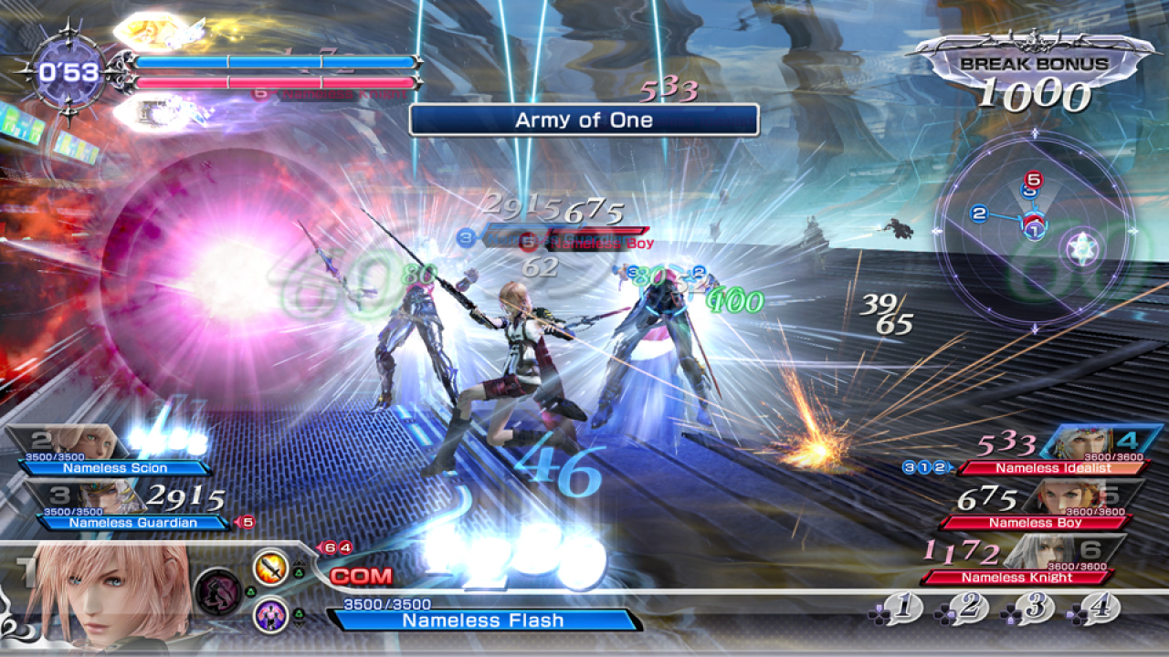
Here's a reminder of how it looked:
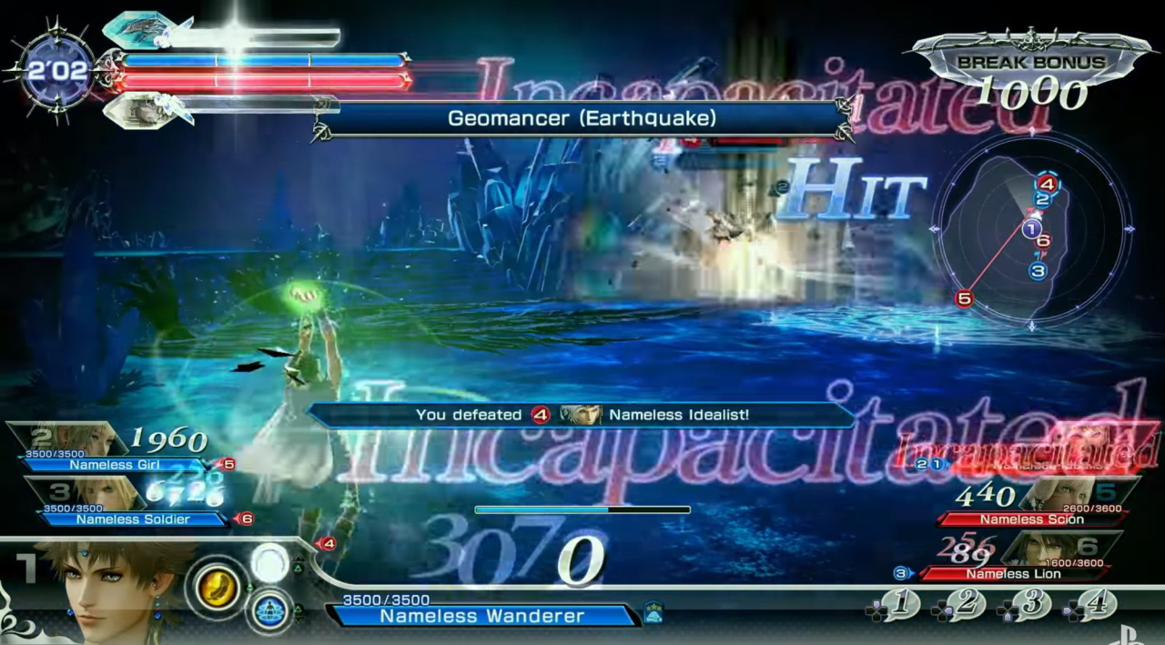
And here's an example of just how ridiculous it could get:
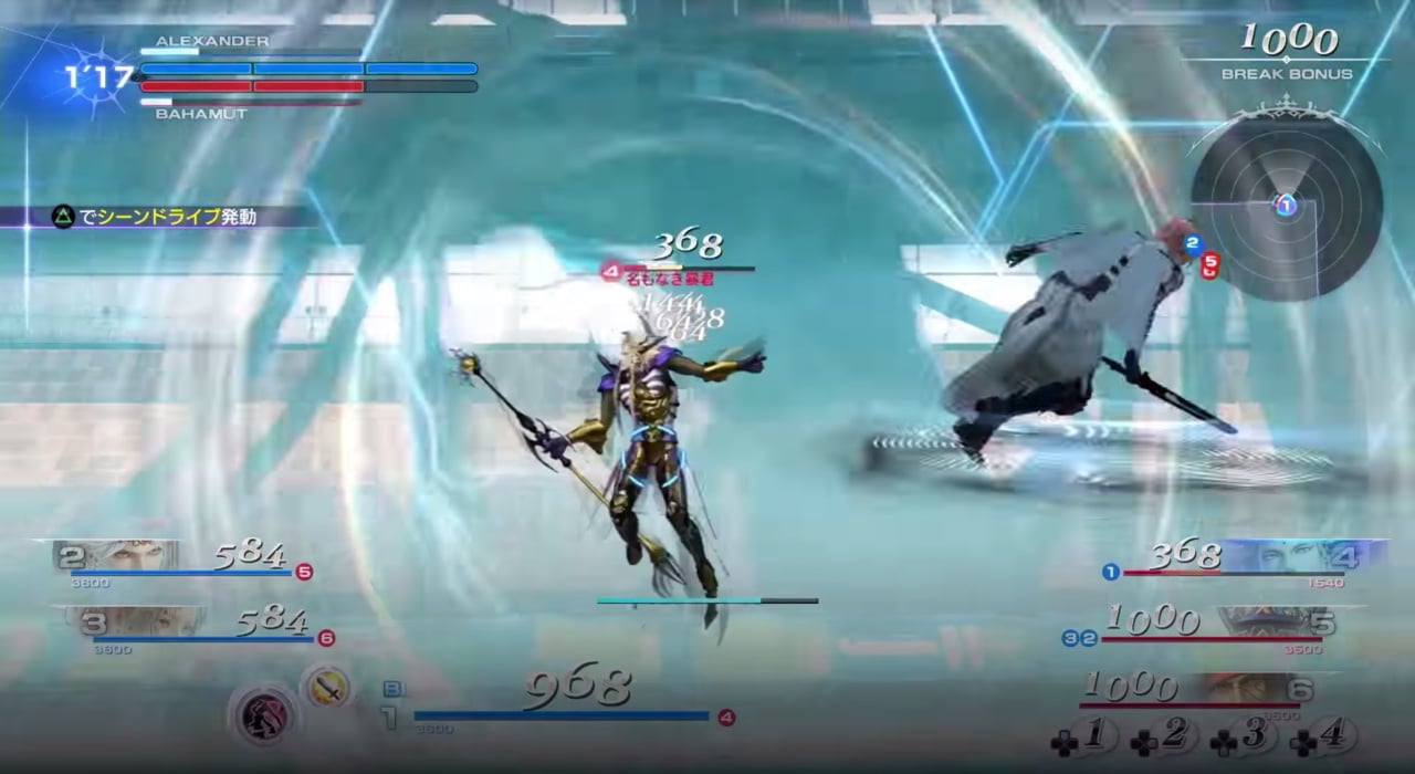
Fortunately, the HUD has now been altered for the better. Going off the new Tokyo Game Show 2017 trailer, the HUD has been scaled back dramatically. All the information is still there, but it's not displayed in a way that takes up 60 per cent of the screen.
We still don't think that it's perfect, but it's a definite improvement:
Subscribe to Push Square on YouTube168k
What do you think of the changes? Is it good to go, or does it still need some refinement? Give your eyes a rub in the comments section below.


Comments 11
to be honest after playing the Beta i didn't find the original that bad but the changes are better
one thing i am glad of though is they got rid of the "Nameless........" on the health bars, they really wasn't needed
^ Same here, I thought it was AFWUL from the screens but playing the game it was surprisingly not distracting. I still welcome the improvements anyway.
Played the beta and in all honesty it didn't really bother me, but the changes do look better.
But the actual hud itself looks bland now, the old hud may have been too much but atleast it looked good stylistically.
Now we need a good practice mode the one on the beta was way to messy.
I played the Beta and thought it was awful and pointless and hated the style of the character design.
Looks like an improvement, though I’ve never played the game. Is it a spinoff title?
@flummerfelt It's basically Smash Bros. only for Final Fantasy characters. The game itself is like a fighter-RPG hybrid.
The old HUD wasn't too bad during the beta. But the new version is much sleeker and more appealing to the eyes.
It does look much cleaner. That might be the best they can get it to be honest. Any more shrinkage and it'd be hard to see.
Great job developer hopefully you don't need to look at much of it to be decent at it
Show Comments
Leave A Comment
Hold on there, you need to login to post a comment...