Modern Warfare 3 just landed on PS5, bringing with it the 16 original maps from 2009’s Modern Warfare 2. From Terminal to Wasteland, some of the best Call of Duty maps ever made have received a facelift — definitively bringing them into the modern gaming era. But how much has Infinity Ward actually changed with these classic maps? Is this just a resolution boost? Or has there been a change in artistic direction?
That’s exactly what we aimed to find out, as we wandered the iconic streets and corridors of both the 2009 and 2023 versions of these maps. And what we discovered was quite interesting. You can check out our extensive comparison of all 16 maps over on the Push Square YouTube channel.
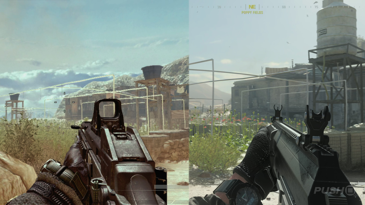
Of course the 2023 version sports 4K resolution, higher frame rates, and the more realistic art style that the Call of Duty franchise has donned in recent years. In isolation, Modern Warfare 3 is naturally the better looking game — we’d hope so after 14 years. However, we have to say that we prefer the art direction of the 2009 versions. From more exaggerated sound design to far more vibrant vistas, the original versions just have much more character in our humble opinion.
That just isn’t really the case for each of the new maps. We really like the moody atmosphere of Underpass, and you can really feel the density of Favela — there’s no doubt that the extra graphical power goes a long way to selling the setting. But the muted colour palettes are so apparent when put side-by-side.
What do you think of the new Modern Warfare 3 map designs? Do you think they look better? Or do you prefer the art direction of the originals like we do? Let us know down in the comments.


Comments 47
Is MW3 pushsquares new favorite toy to chew on now?
It’s the same with that Snake Eater remake, any artistic direction is completely gone. Just graphical fidelity isn’t interesting, a really realistic Unity test room looks infinitely worse than a level from Banjo Kazooie.
Been playing for a few hours now and have no issues with any of the changes.
Lets just try and enjoy the game guys.
This seems to be consistent with modern shooters. But no where near as bad as bf2042. That game looks worse than bf1.
@Jacko11 Doesn't mean people can't talk about it
@Rioichi missing my point entirely..never mind buddy.
@nessisonett was just about to mention you too about this .
it’s been a thing in the industry for a long time now , i recommend people watch “crowbcat” videos on youtube to get a better understanding of how devs cut corners and don’t put nearly as much attention to detail with their games as they used to.
@RedRiot193 lol people like him are why it’s ok now . they know people will just be ok with anything they do so why even try anymore , it’ll still sell a lot anyway and the minority doesn’t matter .
I really wish Activision hadn't ditched the MW3 remaster
@nomither6 people like me?
The fact is there is nothing wrong with the maps, people are being far too nitpicky.
The campaign is garbage but multi is fine.
Check yourself.
@RedRiot193 ok? Not sure of the point.
What a ***** up piece of a game stump this is.
@Northern_munkey
What was your point then?
@MikeOrator my point is this..MW3 is the new chew toy for pushsquare. Cyberpunk and hogwarts are 2 prime examples where there were countless,needless articles written in a way to court controvesy for those all important viewing figures. One could argue if you dont like it then dont click on it (I've only myself to blame here for allowing myself to succumb) but here we are. Of course sites are allowed to cover the latest games but pushsquare sometimes appear to deliberatly print articles that focus on the negatives more than the positives. How many positive things have been said about this game on this site? Not as many as they like to point out its failings. Thats my point and now sit back and see how long it takes to move on once the squeaker has broken in this chew.
@Jacko11 aw struck a nerve tough guy , that’s just your opinion .
@Northern_munkey
I get what you are saying and sometimes I even feel all your same frustrations. You are right though, this site relies on engagement in order to earn money from advertising and MW is going to get the most clicks because it's new and people want to engage in it. Like a Dragon got some love this week as it just released, the new PS5 redesign is getting some extra love because it's new. And don't get me started on all the Spider-Man content lately. I just take it with a grain of salt as there is not much else we can do.
Besides I'm here for the lively conversation around all the articles
@MikeOrator I'm here mainly for the interaction with you guys on here and also because when pushsquare are on point its the best playstation site around but they do like to kick the hornets nest at every chance they get.
@nomither6 insert oooh you’re hard gif
Wow really scraping the barell here for reasons to jump on the hate band wagon lol.
@Jacko11 It's a pretty straight forward point.
Looks the same as i remember my 3 tours looking in person. Glad it looks real and not so colorful and cartoony
modern warfare you no what you getting before you buy it never going to change so its like marmite you either love it or hate it
Haven’t played a cod in a few years, really enjoying the nostalgia of these old maps, hardcore for me,
@Northern_munkey clearly you didn't read the whole article. It stated that thay liked the old game better. Not the new one.
@Rioichi Did you even read this article? Obviously they're talking about it hence this god damn article.
@RedRiot193 bf1 was actually a great game. And bf2042 well that was originally made for next gen like ps5. Thay downgraded the game so much that it looks plastic graphics. Just for it to be playable on old gen like ps4.
@xXOMGitsEddieXx no i read it..
@xXOMGitsEddieXx And its whole not "hole"
@Northern_munkey well both Hogwarts legacy and cyberpunk have already had there fair share of bad news and hate on this ps website. Remember when Hogwarts legacy got boycotted and which failed. Or when cyberpunk showed us fake ingame footage stating even the rubbish in the bins was not only graphically realistic but it had could even be filled up overtime before being picked up and emptied via dump truck. Both of those wore in an article long ago on this ps site. So go dig though the archives of past news or maybe Google it.
Removed - inappropriate
Removed - trolling/baiting
@Ennui maybe because your not an OG gamer who has played the old games at their peak or maybe even from beta.
@Yaycandy sounds like you wore way too young when you played the old game to be able to say it's the same game.
@xXOMGitsEddieXx obviously you edited it when you read it after it was pointed out to you. Not sure what your issue is with me nor do i really care to be honest. If you dont like my comments hit the ignore button 👍
@xXOMGitsEddieXx "sounds like you wore way too young when you played the old game to be able to say it's the same game." And i have dyslexia...
@StylesT Tbh this article talking about the old multiplayer maps and then comparing it to the remastered versions is kinda weird given them stating that hardly nothing was done. And yet I can see clearly that the remastered maps look better due to the brightness and more realistic colored terrain. Where as the old OG map now actually looks foggy and really film grain like.
@Northern_munkey Tbh I didn't even know you could edit comments. As If I changed mine lol 😆.
Removed - inappropriate
The only reason this game has all those original maps is because they didn't have time to make any new one's, disgusting how Activision/blizzard run their company for these past few years, would be great to see Sony bring back killzone and motivate Activision/EA to stop releasing garbage.
@xXOMGitsEddieXx wut. New one looks like actual war. Which is a good thing.
This comments section is the real modern warfare
@Jacko11 Still a little lazy who would have u would see the same maps rehashed so many times and the most shocking thing is that it's €70.
With ofcourse monetization with a battlepass and "microtransactions" with as high as €20 or more now already?
You said it yourself the campaign is crap and the multiplayer is fine thats great to hear so I can finally put a bullet in COD forever and bury it. I loved MW 2019 but this is looking like a joke now.
Are there any new maps in there or is this the same stuff repackaged for more then a decade in a row?
I don't know whats worse, the fact they released what is basically a $70 DLC map pack with a lazy campaign or the fact some are defending it.
This should have been $30 as DLC tops.
Year 2023 reached a new height of games released unfinished and people mocking games to the death.
There's not much so far, that I don't like about MW3. I'm in the 4th mission of the campaign and so far, I'm enjoying it. Even if the 2nd and 3rd mission felt a bit like I'm on a Multiplayer map in the campaign.
The Multiplayer is spot on. I'm still very comfortable with the MW2 maps and have to get used to the MW3(or old MW2 maps).
The disc feels a bit useless, I really feel that buying digital makes more sense in the meantime on Call of Duty. Especially since there's, again, nothing on disc.
@Northern_munkey I never said it was the same game. I said it wasn't the same and that the old original games wore better for there campaign/story lore.
@Yaycandy Only the warzone and battle royal side look and feel like a war battle.
@xXOMGitsEddieXx xXIttakesmonthstothinkofareplyXx
Show Comments
Leave A Comment
Hold on there, you need to login to post a comment...