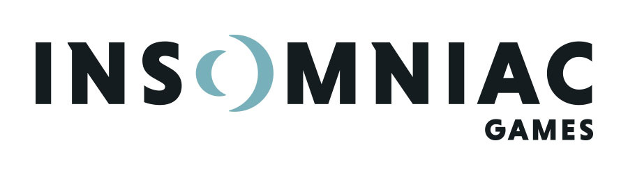
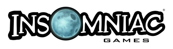
Insomniac Games has shed its iconic moon logo and replaced it with something that you’d associate with a start-up social media agency. The company’s new look has lost the intergalactic theme, going for something a little plainer and cheaper to print on t-shirts. It doesn’t look terrible – and the moon motif is still there – but we’re not entirely convinced it fits the fun-filled ethos of the firm.
Not that a logo means much, of course – we doubt that it’s going to have any bearing on the quality of the developer’s games. And with the excellent Spider-Man up next, we’re sure we can put up with a plain-looking logo screen if the quality of the final product is good.
[source insomniac.games]
Comments 23
I actually like the new logo, but there's no contest next to the old one for me. I understand why they've changed it, though.
I like the new logo. Looks a bit more professional. The old one looked like something an intern drew back in the 90s. It's iconic, but aesthetically not very pleasing.
@toon_lonk1 Clearly not considering we've published 30 or so other articles today?
Hope the move away from the old logo doesn't signify a shift away from their intergalactic titles like ratchet!
Never really get logo changes. They are hugely expensive and generally come at the cost of identity and heart.....or perhaps I read too much into these things 😂
Well, I associated it with Ratchet and Clank, and god knows when we are going to get another one of those (It wont be on PS4 that's for sure)
@get2sammyb It looks boring and uninspired cant see how this is a upgrade. Just like that great title FUSE they made for EA bland and boring. I you saw what fallout Ubisoft got for their logo change.
Man that moon was iconic when booting up the old Ratchet and Clank games and fit the theme so well.
That new one is boring. The old one is a lot more fun.
oh man that's horrifically awful, like they make Soylent Green or something. Like it should be on the side of the building that unleashes Skynet. Are they making a Blade Runner 2 game? Or Portal 3? It looks very Portal. Also looks a lot more like Maniac. Maybe Lex Luthor's HQ?
Sure, the old logo was a bit kitschy, but it was a fun videogame company making fun games. This si straight out of THX 1138.
New Insomniac dress code.

I'll just leave this here...
I don't dislike it,yeah it looks more professional but I wished they had just kept the old Logo.
But to be honest,I don't care about game company's Logos.It's not like I won't try their games cuz their logo is naff.
Looks awful, what's wrong with the old one?
Well, generic corporate branding is the thing these days.
This is less Ratchet & Clank and more Fuse.
Much better than the moon logo. Atleast this makes sense.
@ShogunRok Indeed and thats a really bad thing.
I like the new font but the O doesn't come across very well. You could tell they wanted a much more minimal brand.
I like it. It'll take a bit of getting used to after seeing their previous one for so long, but it's easier to read, nice and clean, and retains the iconic moon. There is a definite trend these days towards straightforward, clean design, and this new logo feels much more modern.
The 'O' is great because it not only keeps the moon stuff, but it uses negative space to also, well, be an 'O'. It's clever stuff.
One thing I don't think they needed to keep is the serif on the 'N's. They should've gone one way or the other, I think.
I like logos.
Ah here
exactly how is the new logo cheaper to print?
I like it. Cleans things up more.
It's nice and clean looking Now show us a New R&C game PLZZZZZZZ Insomniac!!!
I have mixed feelings about it. Of course, the previous one is better by far. Hope this doesn't mean we won't get another R&C.
Show Comments
Leave A Comment
Hold on there, you need to login to post a comment...