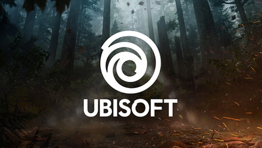
Ubisoft’s got a new logo that’s… Virtually identical to the old one. The purple swirl that you may have become accustomed to seeing at the start of Assassin’s Creed, Watch Dogs, or Far Cry is now a transparent white swirl. The font’s different, too, so there’s that.
But why all this change? Here’s what the publisher had to say:
Today, we create worlds – worlds that live as video games, comics, movies, TV shows, books, and amusement park rides. Our new logo is minimalist, modern, and monochromatic. It's a window into our worlds, giving a preview of what's to come by highlighting the artistry that goes into creating them. The swirl and the letter O are both deliberately created to be reminiscent of hand-drawn shapes and represent our human qualities of enthusiasm, curiosity, and the grain de folie that Ubisoft is known for.

Phew, that’s the worst paragraph we’ve read all day – and we’ve spent half of it on NeoGAF. Seriously, though, one of the underrated treats of a new Ubisoft game is seeing exactly how it’s going to animate the logo during the title’s start screen, so that tradition better not have died with this branding tweak.


Comments 29
I have a degree in fine art and even I find that paragraph pretentious.
If removing colour is considered "modern", then put me in a time machine already.
get em sammy
Fancy Schmancy!
Vivendi's gonna love it.
As a graphic designer, the new logo is a lot easier to use in a greater variety of products and certainly a lot cheaper to print.
That being said, its does look like a step backwards. The blurb is definitely pretentious and I certainly wouldn't have associated Ubisoft with those characteristics. If its representative of them, does that mean they are creating minimalistic games? Just making 1 (mono) game and releasing it over and over again in different skins, different eras?
I'm sure this new logo will certainly be iconic.
A bit off topic, but I think the only good recent Ubisoft games were Rainbow Six Siege and Wildlands.
@BAMozzy But they already have a monochromatic version of their old logo that they already used in a variety of printed products.. and in my opinion it looks much better than this new monochromatic version: http://vignette4.wikia.nocookie.net/logopedia/images/c/c1/Ubisoft_logo_Monochrome.jpg
"We decided to leave our new logo in an unfinished, colourless, state to better represent the quality consumers should expect from our games."
There I fixed their statement.
@paulo1manso and that looks waaaaay better then the new one. This new logo looks like the top view of a turd.
@paulo1manso Of course and I agree it does look better but what I meant was that in every situation the new logo is easier because its always monchrome. The other logo has to be either colour - and very specific colour with the gradients or if that is not possible, the monochrome without any gradients.
Of course for the majority of people, it really doesn't make any difference. I expect it cuts down corporate costs - like headed paper (if they still use that), business cards etc. I know they could use the 'old' monchrome design but if you have a 'colour' logo - it looks a bit cheap to use that instead
Slow news day. E3 can't get here soon enough.
I didn't think I could dislike Ubisoft any more than I already do.
I love all these snarky replies. Makes me wish I came up with something... Too late now.
Sacré bleu, what a load of tosh.
The 1986 is one still the best tbh
The "O" in Ubisoft is really annoying me for some reason
The only thing I heard from this article was "illuminati, illuminati, illuminati!"
Seriously though, looks like an eye to me..
Guess people will call anything pretentious.
I think that Ubisoft's logos from 1995 & 2003 look a lot better than this one.
I like the fact the 'O' is broken. A good representation of most of their releases.
I'm not a fan of these new flat/minimalist logos. The one @paulo1manso posted looks way better to me.
@ohhaime i wish i could like that comment more than once ^_^
@bbtothe
I read that in Simon Peggs voice.. Worked a little too well.
@Bingoboyop
For me the previous one looked like water flushing from a toilet viewed from the top as well. And now your interpretation lol.
"We create cash cows that we squeeze via different mediums until people get sick of them". Might as well use $ or € or even £ as your logo.
As a designer, ubi's pretentious explanation made me cringe.
@ThroughTheIris56
Apple preempted everybody already.
Show Comments
Leave A Comment
Hold on there, you need to login to post a comment...