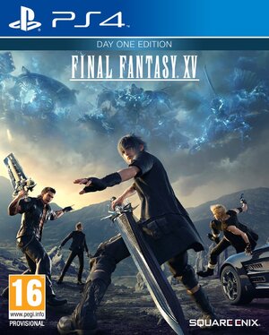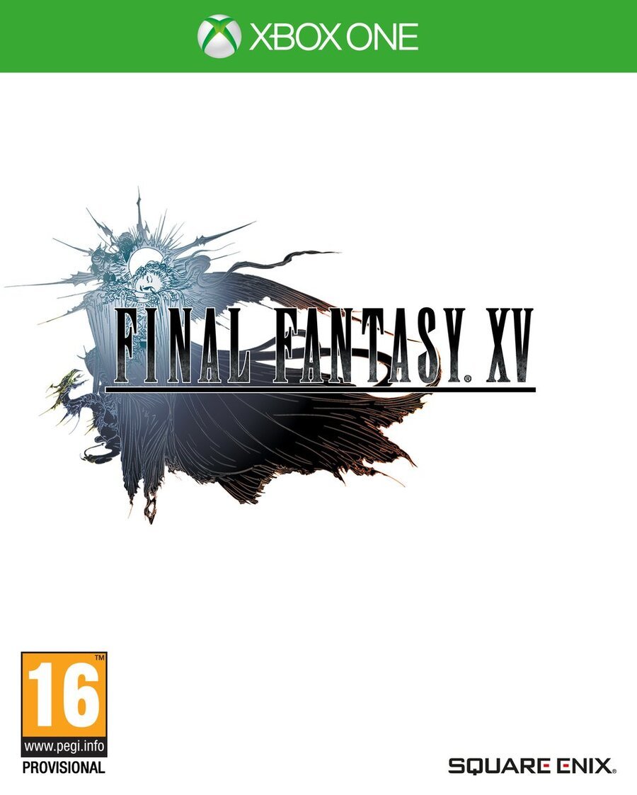
Having grown up with more traditional Final Fantasy games over the years, it's no real surprise that we here at Push Square prefer the classical approach to the series' cover art. We don't want Lightning's moody mug staring into our souls - give us that lovely logo and the white background, thanks.
Of course, in predictable fashion, when Final Fantasy XV hits store shelves it'll boast a cover featuring the adventure's four main characters. Don't get us wrong - it's not a bad cover by any means, but we still find ourselves yearning for that iconic look.
Fortunately, Square Enix has revealed that the cover will actually be reversible, allowing you to swap Noctis and the gang out for the game's pretty logo. In Europe, the alternate cover will come with a white background, while in North America, it'll sport a black one. Thoughtful, eh?
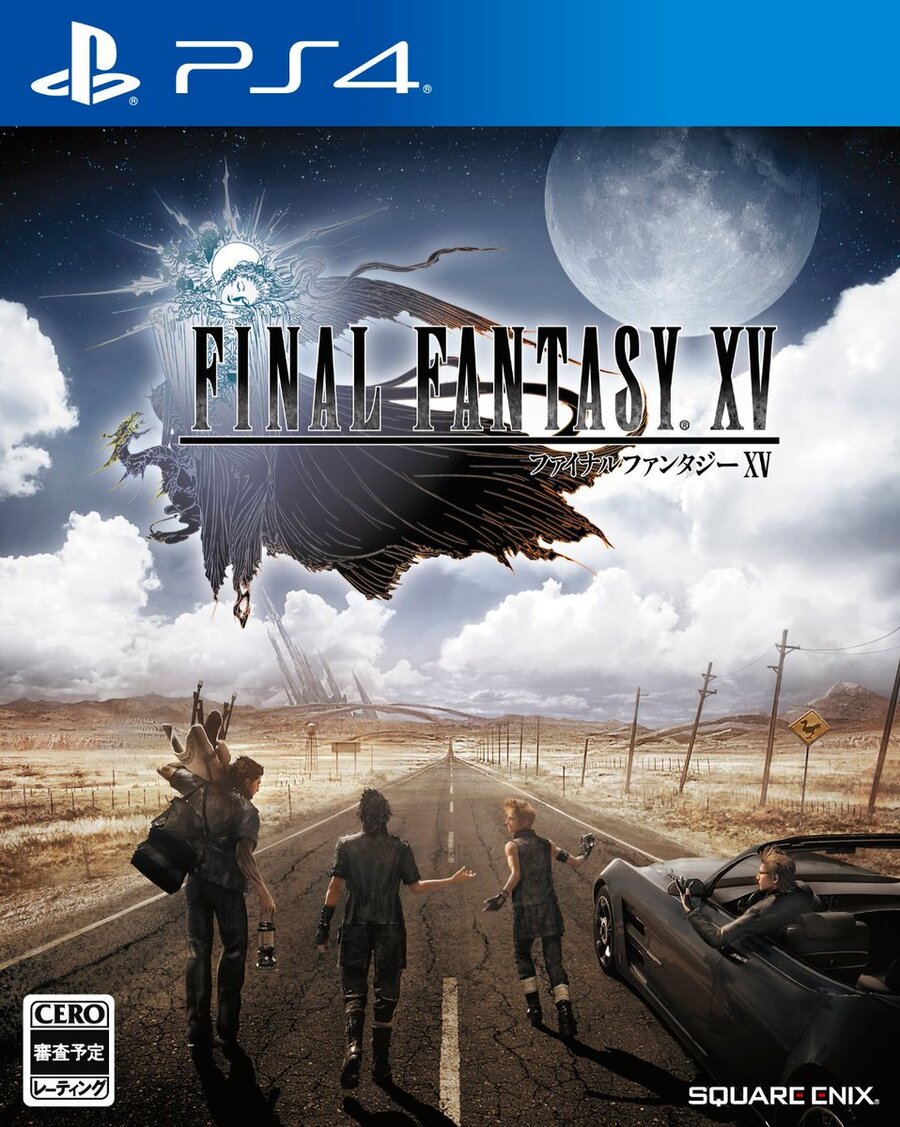
Still, we reckon that the recently revealed Japanese box art is a nice compromise in that it seems to straddle the line between both designs, but by this point we're used to Japan getting the coolest covers - the lucky buggers.
So, will you be reversing that cover as soon as you have your copy? Tell us which art you think looks best in the comments section below.


[source twitter.com]


Comments 11
I want the Japanese cover! Western ones always have to look action-y and someone staring at you on the box. The Japanese one shows the true brotherly essence of the game. Wish we had a choice of the standard covers to!
going with the Classic plain white and logo i think
Won't be able to switch mine around cause I got the limited edition steelbook edition with the abstract art ordered
@stocko the limited edition one has a Japanese style art piece on it. It also comes with a bluray of Kingsglaive, and if u have Amazon prime u can get it for 20 percent off which makes it more affordable
I dont really care to be honest lol
Standard White with logo for me, please
@FullbringIchigo Ditto, I love the classic look too.
Who decided this was the cover, haha? The title itself is so small, and the pose Noctis has is just so awkward. Plus, his shoes and sword are just ever-so-slightly cropped...why can't he be completely inside the image frame like everything else?
Regardless, I'm probably getting the special edition with the movie anyway.
@stocko Japanese one looks better from both an artistic and action standpoint. Not sure why Square Enix is so out of touch in America.
Definitely Japanese version looks better here.
Alternatively, just print the Japanese one with a good printer (or take the hi-res image to a photo studio and print on an enameled photo paper) and place on your bluray box.
I'm doing with the steelbook covered in Amano artwork, looks absolutely stunning! Otherwise I'm a big fan of the classic look so it's nice they're offering an alternative.
Show Comments
Leave A Comment
Hold on there, you need to login to post a comment...