Here’s food for thought: what design will the PlayStation 5’s boxes adopt? We already know that the device will include a Blu-ray player, so it’s unlikely you should expect a different shape or size of case to the PlayStation 4 – it’s not like it will have to accommodate Nintendo Switch-sized cartridges all of a sudden, for example.
Furthermore, PlayStation boss Jim Ryan has talked in detail about how important it is for the manufacturer to maintain consistency with its current product, so we’d expect it to adopt the same general format, with branding at the top and on the spine. But while some degree of uniformity is essential, it’s also going to want to ensure that PS5 products are set apart from PS4 ones.
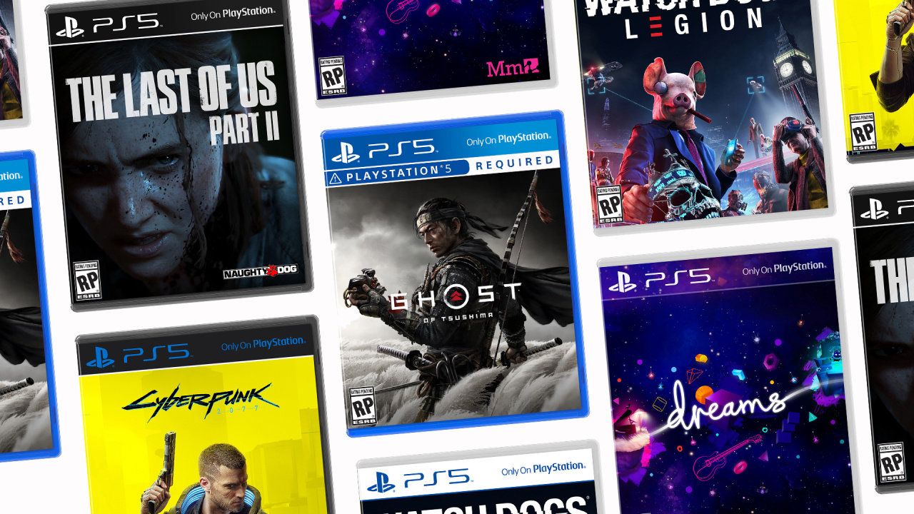
As such, we think it’s probably going to come up with an alternative colour scheme, and we’ve dreamed up some mock-ups which imagine how the packs could look. These are all our own ideas, and shouldn’t be taken as confirmation of anything. Nevertheless, it’s interesting to speculate how PS5 games may look when they eventually hit store shelves.
Blue with Bumper

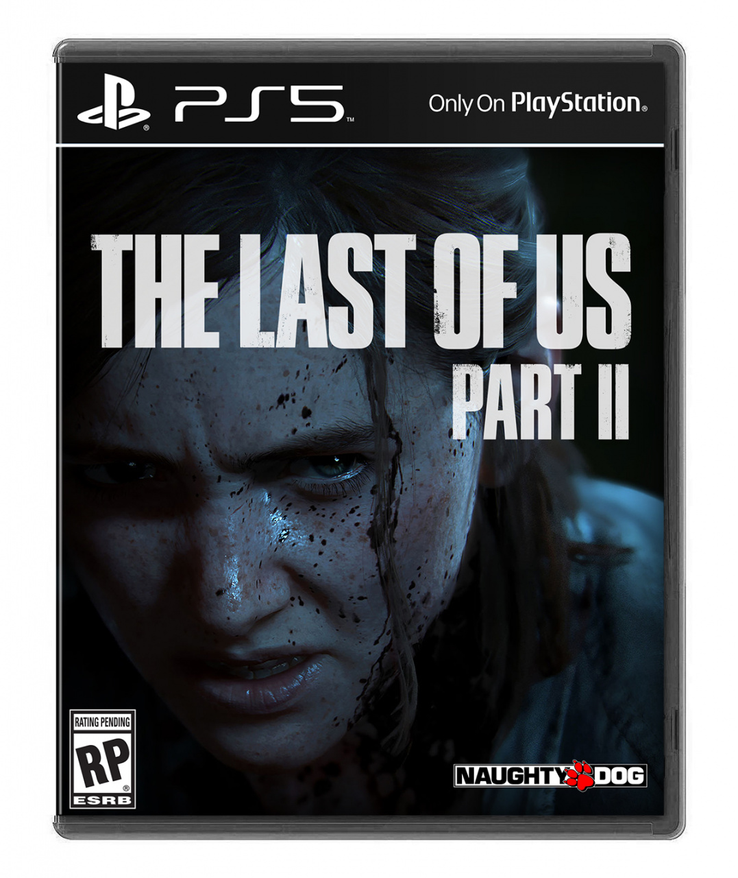
This box art is effectively exactly the same as the PS4 case, but with the PS5’s logo added to the header section. However, in order to set the next-gen system apart, it has a ‘PS5 Required’ bumper in the same style as the current ‘PSVR Required’ strip to avoid confusion.
Black
Sony may want PS5’s cases to be completely different to the PS4’s, and we reckon these black boxes look very stylish. The problem is that they may not “pop” on store shelves when situated next to the electric blue of the company’s current console.
Black and Blue

One way of ensuring the box arts look different on store shelves but still maintaining the “pop” of the PS4’s blue is by combining it with black. This kind of colour scheme is currently being leveraged by the platform holder on the PlayStation Blog, and while it could be a coincidence, we can’t help but wonder whether the organisation is teasing something.
White

While the PS4 uses bright blue as its primary colour, it offsets this with white symbols and fonts. One easy way to set the PS5 apart is to simply flip the palette, with white being the primary colour and blue being the secondary. We reckon this scheme would look great in stores next to PS4 games, and the plastic of the cases could either be transparent or white.
Transparent
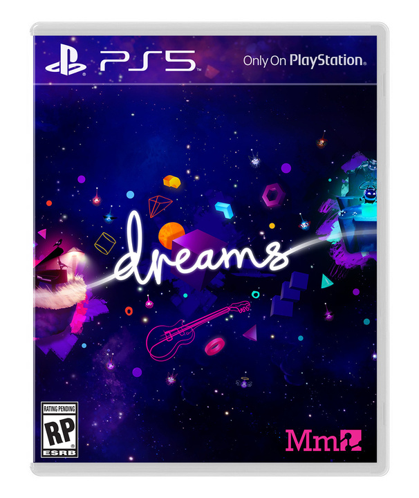
Another option is for the platform holder to not focus on any colour scheme at all, extending the design of the box art through the branding at the top. In this example, Dreams’ purple pattern runs right to the top of the case, and it’s complemented by a transparent box.
These are some of our ideas for the PS5’s box art design, but what direction do you think Sony should go? Do you think the manufacturer should stick with blue, or adopt a different colour entirely? Which of our mock-ups do you like the most? Imagine a GameStop display in the comments section below.


Comments 72
I'd love Sony to go back to a PS1 style case with black boarders, without booklets theres a load of waste on the boxes make them smaller and thinner
Go back to the ps3 design. I have 175 ps3 games and I’d like ps5 to compliment that collection.
Was going to say for the black at first but the black and blue is pretty stylish.
Problem with black is that it just reminds me of PC game cases. I think they'll stick with blue to keep up the red, green, blue thing the three major console manufacturers have going on. Personally, of those above, I prefer the transparent one.
Extending the design of the box art through the branding at the top looks really good, with a black box will be sick.
@Matroska There's few-to-none physical PC games these days.
White is my favourite, but the Black and Blue, and the Black ones are also good.
Sony's blue stands out well in the gaming market, so I'd like to see it as part of the design. The PS4 and PS5 game cases should also be visibly different from even the slightest glance.
black and blue cuz i don’t want them to re-use a design, white just looks meh and transparent should ALWAYS be saved for special editions and some titles as opposed to being an everyday thing. otherwise, it would lose its special aura. plus black and blue looks like the next logical step. it also looks pretty futuristic/modern.
That white box with blue lettering is slick. Behind that I'd say stick with the blue box/white lettering, and surprisingly I'd pick black box with blue lettering as my third choice.
While I like the idea of the transparent banner I think the white with blue lettering is the best idea. It sticks with the current recognised colour scheme but flips it for the differentiation.
@RedMan33 Whilst I wouldn’t like to go back to the hard plastic of the PS1 boxes. I would certainly like them to give the current boxes a bit of a trim.
I think black is cooler, it's like ps2 cover.
To be honest all of them except for blue one black could work. The blue one black just doesn’t have enough contrast. If your only option for the text was white for the transparent option would have an issue with games like Burnout Paradise that use a white background. The white on black was used for the PS2 and PS3 and the white on blue was used for the PS4. So the only original design I liked was the blue on white.
The black on The Last of Us 2's cover is super slick. Oh man!
But that transparent cover is super nice too. Helps show more of the cover art.
The black and blue one looks nostalgic for some reason.
I'm gonna go for the black one though. Looks kinda classy I think.
Transparent looks great!
The black and blue is horrible. Would be hard to read for some folk.
My personal favourite would be the white. Looks great and would stand out a mile too. They could maybe integrate the shape colours too with it. Change between the green, red, blue and pink. Maybe use gold for exclusives.
its whats in the box that counts
I like the white label but not with a white case. I’d mix it up and put the white label with the blue lettering onto a blue or black box. The transparent seems “second hand” to me.
... of course it won’t really matter since we’re all going to be forced to be digital mostly in the future anyways, right? 😉
About a red one.that would be cool.i always l😍ve the greatest hits red case.word ☝ up son
i went for transparent, not really that fused on the other colours, except the blue one, and it looks pretty much the same as the PS4. i think they'll change the shape of the box - i suspect it'll look very similar to how 4K-UHD blu-ray boxes look in the UK, but still be blue. it's pretty striking when you walk into a videogame store and see the big blue banners for the playstation section, a branding recognition it just didn't have with the PS3 imo.
one with bewbs capable of riding a bicycle, please.
I like the white/blue one but they're all good.
@Ryall I mean more like a 3DS box, but in the style of the PS1
Black just looks like a PC case to me. Think I prefer the transparent from these options...
The Black on blue is by far the best. With the white and blue coming in second.
black however my purchases are digital only.
@makina Oh yeah, I know. But the association is still there in my head. Like if they did rectangular cardboard boxes, I'd think of the SNES even though that's also a thing of the past.
White. Transparent won't work with all games, cover art might clash with font.
Before reading the article I would have said blue but after seeing the white cover I picked that.
Looking at the first one, i think it could be a problem with clueless people buying PS5 games for their PS4 on the early years of PS5. The PS5 logo is too close to PS4 logo.
Maybe keeping the blue theme but with different header or a different kind of blue, darker, matte or with a different form factor...
Ooh, I love the black and blue. The transparent would be nice on Dreams but other games might not work so well.
I’ve gone all digital so... lol. Seriously, I like the black one.
@nessisonett Not 100% transparent, lets say 75%, it may blend nice with most covers.
https://imgur.com/E7x6Fv4
I never knew I wanted black and blue until I saw it. That's my vote.
Always a PS guy, but the Xbox One cases with the uniformed spines always intrigued me.
I really like the idea of a transparent border that blends in with the rest of the box art
It kind of takes the minimalist design ideas of the Switch's physical games and pushes it to another extreme of having no colors bordering around the art itself and making it all blend together really smoothly
I really like the green, red, blue trifecta, so I'd like PS to keep blue as its main color, even though I wouldn't want the new cases to look identical to the PS4's.
Maybe they could do something similar to MS: 360 was light green and white, while One is a darker, uniform green.
Changing hue might be a solution.
Blue background change to lettering color Red, Black, or Gold.
I want programmable led lights in a clear box that will pulsate a color for the theme. Light blue for slow casual games or red for fast paced action games for example. So no color, but in reality all colors. Go down the ps5 isle and it will be a beautiful light show.
Umm I'll go with black background like the Logo? Instead of blue? Nobody noticed?
😀
All of those are trash. They should adopt Nintendo's case and use the triangular logo they already have and stuck it in a corner. Minimalistic and nice.
None of the above, maybe a variation on the old PSX case and not using as many materials.
Can't believe how many people voted black. How dull! Transparent ftw !!
That Black and Blue just makes me feel happy.
Golden? How about that or orange 🤔
Either the black or the transparent one.
Boxes really should be smaller, not only would they save money on plastic, also good for the environment, I would be able to fit more on my shelf 😅 color scheme I'm going to go with white, should be different to previous ones but not too radical.
If you didnt pick white you got a zero
Black and blue all the way! Really looks awesome!!
Kinda dig the idea of a led light in the boxes.
Make the case black but transparent lettering, combine it with a blue led light and the PS5 logo catches your eye.
Fast forward to the future and essentials arrive, change the color of the led light and you're done.
Wishful thinking but the idea is pretty nice tho.
i think a copper, gold or silver colour would look brilliant — even better if it is printed on foil stock and has a slight shimmer to it. going with the blue again is not going to cut it. if i have to choose one from above, though, i would go with the transparent option.
Something that used as little plastic as possible would be my choice, but that's not really what you asked here.
I think the white one would be a nice change of pace but not sure if it's "PS" enough. Don't really care tbh as I rarely buy physical these days.
I'm actually surprised, i'm usually someone that prefered those black designs PS3 had... but i ended up liking that white design, it just seems like a nice change.
None! No more physical copies!
But aesthetically Imlike the black and blue, white and blue, or transparent. And I think transparent would work best to let the game's artwork come through and not clash whatever other design there could be. I mean, imagine the white one on the "Last of Us 2" artwork... It would totally clash!
But I don't care, cause I will never buy physical copies anymore anyway. And if I do it would be with some kind of set and I wouldn't care what it looked like.
@RedMan33 If you don't want to waste, go all-digital...
@MicHaeL_MonStaR if digital pricing on console was more in line with PC I probably would go digital for more games but while I can get a brand new physical copy delivered to my door for almost half the price of it on PSN I wont be, i also like having something i know is mine I've bought digital games that have been removed from the store in the past, wouldn't be an issue on PS4 as I have a decent sized external HDD but I've lost some from PS3, you never really own a digital game
They need to bring back manuals. If not the can at least make the boxes thinner where there are no manuals.
i really like the White design, it stands out well and draws the eye
I'd go with the Black case, the blue makes no sense and could be confusing, the white reminds me of the awful Switch cases which require a download
Just be different from PS4!
I like both the black and white and black with blue. Voted black/blue.
Back in Black.
Bring back manuals with some art.
I’m digging that Black and Blue. Looks good. I hope they choose that or Black.
Black, bur I feel like the poll might be hurt a little be LoU2’s box art. If I’m honest I don’t like it and it brings down the genes box design a little. GoT looked so much better with black, as well as has much better cover art too.
Sorry to be the boring one here, but what I would really like is cardboard. There are a lot of old games that eventually go to landfill, and given how much plastic we have polluted the earth with, we could learn a lot from Sega and what happened with the pc game I forgot the title of (think it was a football or championship manager type thing recently).
@BorderlineJon Your post is one of the most thoughtful here, very considerate 😊 I don't think it will happen although the N64 cases weren't too bad.
I'm not sure why there'd be a "PS5 Required" tag on a PS5 box... but then again there's a reason they have allergy warnings on packets of nuts :I
I love the white, it would look lovely on my highly colourful shelfs. 😍
White/Blue is the way to go to give the new gen a nice colour pallet switch up as well as help customers know which is which more easily.
I like the UHD bluray style colors. I also wish they were smaller with less waste. I haven't bought a physical game in years though.
I actually really like the white one. I'd be happy with most of these variants.
Transparent looks nice and different from previous cases.
Now they've done away with booklets and maps, why not just go back to PS1 size boxes to save money and plastic
Tap here to load 72 comments
Leave A Comment
Hold on there, you need to login to post a comment...