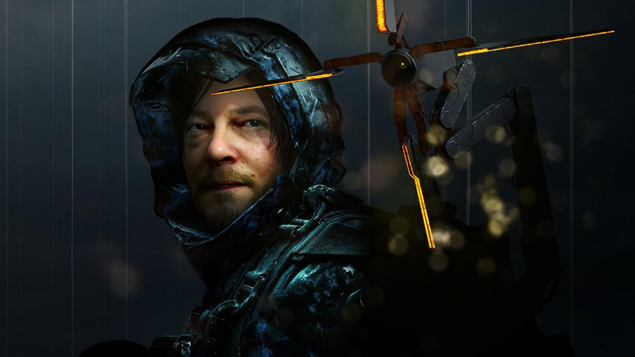
Death Stranding is fast approaching; we're just a couple of months away from Hideo Kojima's latest on PlayStation 4. The game has been a real enigma since the first teaser, and while the mystery remains largely intact, we can't wait to dive in and uncover all its secrets. One aspect of the title that has people less excited is its cover art, a close-up shot of protagonist Sam Porter Bridges looking a bit worried.
Creating cover art that's both marketable and easy on the eye is a yin and yang that's existed in media for decades, and we can't imagine it's easy to be truly original these days. Whatever you think of the official box art, its primary job is to make people pick the game off the shelf. There's definitely a science behind all the stoic heroes stood loud and proud in the centre of modern covers.
But to heck with all that. Here's a really cool idea for Death Stranding's retail edition:
It's the brainchild of Brian Kaufhold and his girlfriend. As you can see, it features a transparent orange case with detailing to make it look like one of the BB containers. It allows you to see inside to the disc, which bears the image of the Bridge Baby. The impression is a box that looks like the incubator worn by Sam throughout the game. It's pretty great, and Kojima agrees; he retweeted it, as he's wont to do with fan creations.
What do you think of this? Is this creative idea a good alternative to the official cover? Plug yourselves into the comments below.
[source twitter.com]


Comments 21
Looks awesome
It’s well up there along with the invention of electricity and those little plastic tables that stop the top of your pizza getting ruined by the box if you ask me.
More companies should put effort into their packaging. I mean adding a steelbook is common practice nowadays but something with a little more creativity, like this, would be even better for things like special editions.
That would be a really cool idea if the discs were left in the case on the shelf.
Would be a great extra to put in a special edition though so you could display it at home.
I like the orange box.
I miss Half Life 2 and Portal.
it's a great concept and it would be amazing if it was but instead we are getting a pretty bland box art
it's strange when a fan can put more effort into a box art than the people who are actually paid to do it
Great idea. Kinda creepy to have it displayed on a shelf but I'm sure plenty of people would be willing to pay extra to display it anyway.
If they do it hopefully Sony pays them for the idea rather than saying they had it planned all along.
Impressive
@Gatatog The Death Stranding Steelbook is a real letdown. 😉
Goes to show Kojima doesn't get everything right. For all his cryptic obscurity-ness I'm surprised at that bland box art (still better than Witcher 3's though). You'd think he would make something like this fan-made one.
Looks great! So rather have that than another boring case.
Brilliant!
that's all I have to say.
@kyleforrester87 so thats what them things in my pizza box are for. Always wondered about that...
@ellsworth004 See, we have a laugh, but we're learning too.
Imagine if Kojima were in charge of the box art. The game would probably come in a tin foil robot that poops out the disc.
@kyleforrester87 Ahhh, so that's what those tables are for.
Edit: Do'h! Just realized someone else also said the same thing.
@TheArt I don't think Kojima designs the box art, but I agree with your overall point.
Speaking of bad box art, this one takes the cake. ICO is one of my favorite games of all time, but the US box art was just laughably bad.
https://www.mobygames.com/images/covers/l/9025-ico-playstation-2-front-cover.jpg
@DreamerAbe86 He may not be responsible but he can definitely have some influence if he wants to.
Literally every fan made case I've seen of Death stranding is way better than the official one....
Pretty neat, but discs don't always get packaged with the art/label orientation matching the box, so.
Tap here to load 21 comments
Leave A Comment
Hold on there, you need to login to post a comment...