While the PlayStation 3’s award winning XMB was undoubtedly a slick interface, it started to feel a little limited as the system evolved. Accessing content was always easy, but the addition of streaming services, digital trinkets, and more really slowed the navigation system down. Fortunately, the PlayStation 4 has been designed with a lot of these features in mind – and it’s already looking pretty great.
This ten minute PlayStation Blog video anchored by Sony Network Entertainment vice president Eric Lempel shows all of the improvements to the interface, ranging from the updated ‘What’s New’ page – which allows you to keep track of your friends – right through to the new PlayStation Store. The latter is similar to the PS3 version, but it appears to be built into the operating system now, meaning that the loading times are a lot faster than before.
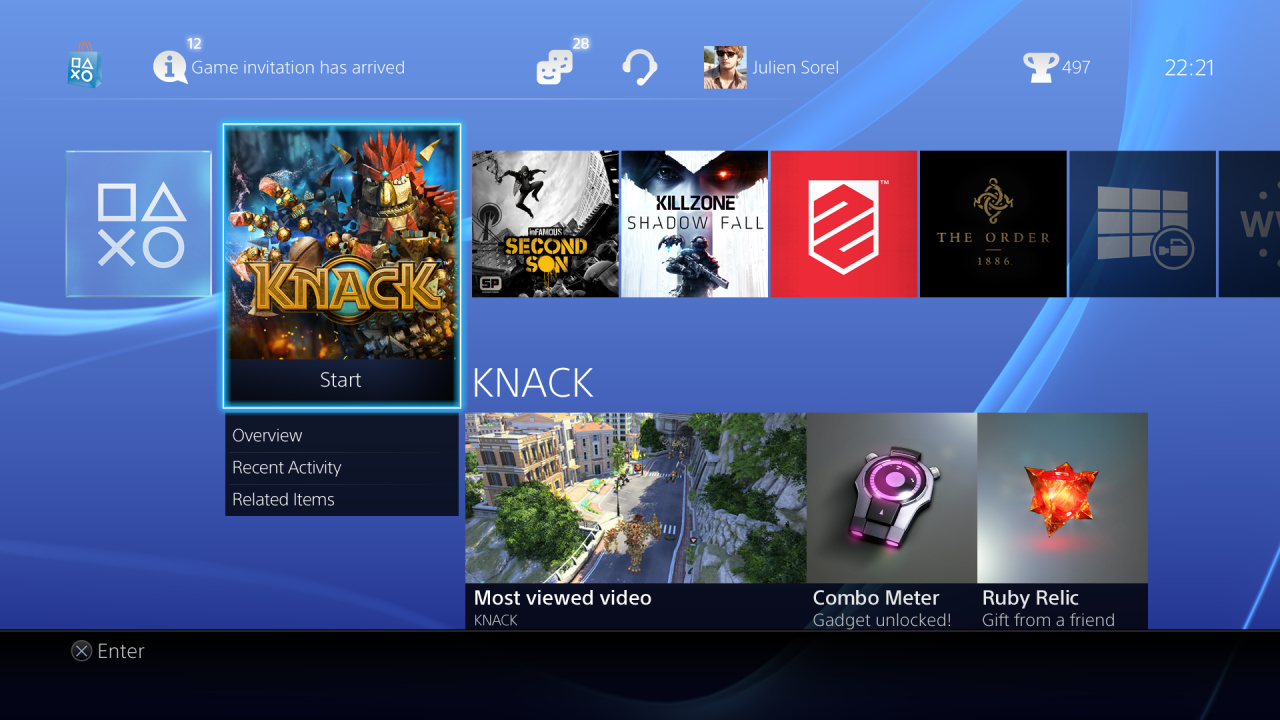
PlayStation Network profiles have been completely overhauled, allowing you to learn a lot more about your friends than on the current generation console. The company has also implemented the PlayStation Vita's vaunted LiveArea feature for games, allowing you to view a social feed pertaining to each individual title. The only thing that we’re not keen on at the moment is the sizeable central bar which contains all of your content, but we suspect that this will be organised in future firmware updates.
What do you think of the new user interface? Have you had a chance to go hands-on with the hub yet, or are you still waiting for your console to arrive? Watch the video, and let us know your likes and dislikes in the comments section below.
[source blog.eu.playstation.com]


Comments 7
Getting mine today when the GameStop opens and I saw this last night on Youtube.
@D3athBr1ng3r187 Are you excited?
Maybe I'm just caught up in having a new console but I think the PS4 UI seems like a massive step up from PS3's.
It a lot better than the PS3's, i also like the Rare trophy suff the PS4 UI is a lot more interactive. I think its a big step-up i've also heard its fast, what he just showed it looks a lot faster, roll-on two weeks 29/11.
almost forgot everytime your turn on your PS4 it looks three months back for game patchies, then downloads them in the background smart yes.
Well I think the PS4's UI is a massive improvement over the PS3. It's also pretty fast including the Playstation Store which was sluggish on the PS3.
@Gamer83 I haven't used it yet, but watching this video it looks amazing. I wish there was a little more organisation between the games and apps, but overall I don't think it's the new console hype that's talking - this is a huge improvement.
I think that someone should show off the Netflix and Crunchyroll app
Tap here to load 7 comments
Leave A Comment
Hold on there, you need to login to post a comment...